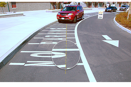
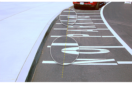
I saw NO PARKING on the middle school pavement the other day, and it reminded me of a small but interesting typographic detail. It’s that round letters always extend slightly above and below their cap and base lines. Normally, you never notice this. I saw it here because it’s exaggerated; the sign crew put 100% of the extension above the cap line . . .
. . . and none of it below . . .
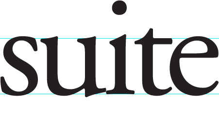
 Except for some novelty typestyles, all type is drawn this way; the round letters are slightly bigger. Here it is in Helvetica Neue Bold . . .
 The reason is to overcome an optical illusion. Since round letters touch the line only at one point, if they aligned exactly they would look too small . . .
 . . . which may be easier to see if I remove the blue lines . . .
It applies to lowercase letters, too. The round ones extend slightly above the x-height line . . .
. . . which is easier to see up close . . .
Note that the flat parts stay on the lines.
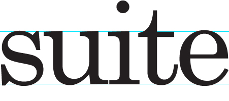
It’s a small detail but universal. Here it is in Century Schoolbook . . .
. . . and Adobe Garamond, which has no straight lines at all. Note that the pointy serifs also extend beyond the lines. Same optical reason . . .
The effect is even clearer in print, with its higher resolution, than it is onscreen.
* * *
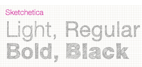
While we’re on the subject of type, MyFonts last week released an entertaining variant of Helvetica called Sketchetica, by Ossi Gustafsson of Hiekka Graphics in Finland . . .
.
Sketchetica is basically Helvetica sketched with a pen or sharp pencil. Back in the day, this is how designers would mock up pages for the typesetter and the layout people. It will be useful for any project that needs that rough-stage look without appearing hand-drawn. Ossi’s giving away the light version for free, which has Sketchetica near the top of MyFonts’ popularity list. Check it out.
.whi.





We used to trace copies of dry transfer letters (always Helvetica) when I was in architectural school 30 years ago . . . none of us could afford to buy the actual sheets. It wasn’t until I had a “real” job that I got to use the actual product. Do I miss the days of dry-transfer lettering? No. And I hope the statute of limitations has run out on the copyright violation, or a whole lot of my classmates and I are going to prison . . .
Those of us who love type are easily fascinated with a topic such as type extenders, so it might be awhile before we notice there are a lot of cars parked in that no-parking zone. I wonder what kind of graphic treatment would solve the problem this school has yet to overcome?
Interesting optical effect to be sure. The Sketchetica is also interesting, but I have seen the sketch/font look overused, especially the slab-serif version (e.g., http://www.dafont.com/sketch-block.font or one of its variants). A local, student-produced magazine seems to use it, and it’s wearing a bit thin with me. I suppose there are places where it may be useful, though.
I think the sketch font has its place. In the case of the New York Times curriculum guides, it serves the purpose of appearing less formal, but still retaining a traditional structure. Paired with the chalkboard graphic, it actually takes on a “chalk board” feel. Speaking as a teacher, it says to me, “Even though I have to write this on a chalkboard, I am still going to try hard to adhere to the rules of good typography.”
Isn’t it the same with verticals and horizontals in the fonts?
The vertical in T is thicker than the horizontal.
Well, it’s true — you learn something new every day!
I have noticed the size variation in fonts over and over for years, and never knew that there was a perfectly sound reason for this. I have had to trace fonts on occasion for 3D work, and I have actually corrected for this perceived error. Oops!
Having it explained here is great, because it now makes perfect sense to me, and I know that I will never look at a font the same way — or worry about what to do during the next tracing session.
Usually you stay outside the lines or think outside of the box to be different. Interesting to see that sometimes you have to be “outside” just to fit in.
Well hot dog, I never knew that! Thanks for pointing it out. And I agree with Margaret (above) — I didn’t even notice the cars parked there until she mentioned it! Amazing what we overlook.
I love fonts, but I am a user not a developer of them. I found this very interesting.
thanks
I thought that when I was taught this way back it was referred to as “entasis.” Looking at definitions now, all seem to refer to the swelling of classical columns so that optically they appear straight and not concave in appearance. This is similar in that it’s a visual technique used to coerce the eye into believing objects appear as we imagine them to be.
Regarding those appearing to be parked in the no-parking zone, note the signage in the driving lane. Maybe those vehicles are actually moving, since they are being detoured.
What’s not visible in the photo is the full phrase, NO PARKING LOADING ZONE. The red vehicle is indeed stopped, but only long enough to load the kids.
Oh, and by the way, I love typography. And this site is pretty cool, too. :)