Have you ever put words or graphics inside a rectangular frame? There’s a good reason not to. While words are full of meaning, a frame is generally a non-communicating element. Technically, it communicates — four straight sides, four corners, a length, a width, a thickness, a color, an inside, an outside, lots of things, mostly noise, that your eye must process but which say nothing. If you don’t need a frame, don’t use one.
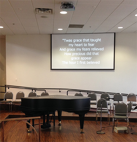
Saw this recently in church. On the wall behind the choir is a projection screen . . .

. . . that looks ordinary enough, but why is it there? It breaks up an otherwise clean wall, casts a shadow, constrains the words to an artificially small space. It adds a black edge, corners, a second surface. It even motors up and down.
You don’t need this. Design-wise, you don’t need anything up there. All you need is a way for the congregation (or any audience) to follow the words.
They could be memorized. They could be in a handheld book or on a smartphone; they could stream through earbuds. Whatever. Easiest is just this . . .

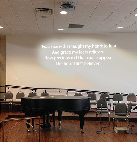
Beam the words straight onto the wall. They appear out of thin air, release their information, then disappear without a trace. Nothing material. No distraction. Just communication.
At the state fair last month we came across this small display . . .

. . . which is the same idea. No reason to add a frame; just write on the wall. The words are the point.
(Formal Futura type isn’t the right choice to express the casual tone above, but that’s another story.)
This works everywhere — wall, poster, web page, print page, with graphics or without. If mechanical constraints don’t require a border but you’re tempted to add one, ask yourself why.
—————
We cover this topic in greater depth in the “Get Unblocked” segment of our Design Essentials video, and in our course Before & After: Things Every Designer Should Know, at lynda.com.


PowerPoint and similar presentations are likely to be projected onto a screen whether I like it or not. I often design slides with a black background to avoid creating a frame within a frame.
My guess is the photos on this post were Photoshopped, since the reason you need to use a screen on a white wall is that the screen has a huge difference in how much light it reflects.
Projecting white letters on a white wall will give you, in virtually all cases, a white wall. I agree it looks better the way you picture it, but I don’t think it would actually look that way.
It’s Photoshopped, but only because I didn’t have a photo of the screen retracted. One day the screen did not work, and the white projection showed up just fine on the wall.
That’s because white walls rarely appear truly white; they’re always picking up ambient colors and especially shadows. A projected image will always be brighter.