Rummaging through my Favorites file and found two fonts.
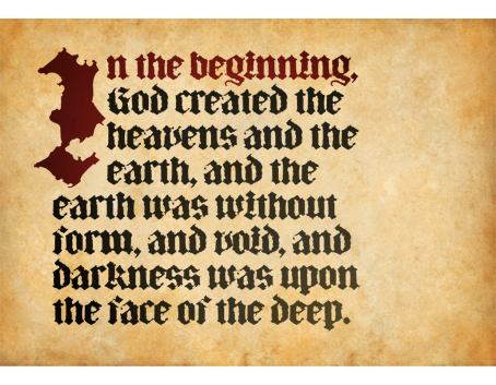
Tritura is new to my library. It’s the best distressed, blackletter typeface maybe ever, full of antiquity, grandeur, weight, and with immense power. The distress is designed in, not added on, and it’s really ragged, some letters approaching illegibility unless they’re in context. A set of small caps is available. I use Tritura for everything I can find an excuse for. Be sure to experiment with subtle color gradations (note, below, the initial cap and first line), which add a rich and even more weathered patina.
The second is LeibeFish, which couldn’t be more different and is only technically a “font.” I’ll just quote from the Web site: “LiebeFish is a collection of 172 individually hand-drawn fish. Each has its very own personality; some are happy, some are sad. Some like company, some are bored, most are cute and a few are weird. If you look closely, some fish will surely look like people you know.” Like a normal font, the fish are available via the keyboard, so file size is tiny and they’re easy to type, although, practically speaking, they’re too detailed for much below 60 pt. Converted to outlines, they become regular art that you can scale easily and color however you choose.
.
—————
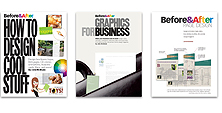
I have a favor to ask. It’s a big favor. If you’ve bought one of our books, I’d really appreciate you leaving some feedback on the bookseller’s Web site.

To help you (and, I hope, give you something in return), I offer six questions from Sean D’Souza that are worded to yield the kind of specific information that makes great, incisive testimonials. You’ll see this when you start writing, so be sure to ask them of your own (or your clients’) customers, too.
1) What would have prevented you from buying?
2) What did you find as a result of buying?
3) What specific things do you like the most?
4) Can you name three main benefits?
5) Would you recommend the book? Why?
6) Is there anything else you’d like to add?
Links to the booksellers:
Amazon
Peachpit
Barnes & Noble
Borders
Thank you very much.
.


Apparently on the Eighth day, after a long, restful Seventh with His creativity fully restored, God created fonts :-)
The best lesson I ever learnt on appropriate typeface selection was to consider the shoes worn by the market you are creating for. If it’s construction, then fonts that are strong and chunky may suit; if it was a ballet company, something flowing and rhythmic should get you there.
Response to favor
It was my pleasure to add a review of “How to Design Cool Stuff” on the Amazon site. I am thankful and grateful for your insights, inspirations, and so competent advice and help.
Thanks!
David
Dear John,
Thank you for your continued excellent contribution to collective style. I am someone who did not purchase, and so rather than leave feedback at the bookseller, I will leave it with you. For context, I am a physical chemist, but I find design very useful in trying to communicate complex ideas (and to sort them out for myself), as well as a pleasant activity for its own sake. I am also an entrepreneur and periodically need to actually wear a graphic artist/design hat for my small business. Your work is most helpful and tends to be delightful as well. Thanks again.
1) What would have prevented you from buying?
I subscribe online, and because I do all of this sort of visual design on a computer, I have little need for a paper copy, although it would be enjoyable to leaf through.
2) What did you find as a result of buying?
I envision I would find a lovely book of inspirations that I would browse as I do my favorite cookbooks.
3) What specific things do you like the most?
a: content is fantastic, with very specific, immediately applicable projects and lots of specific examples;
b: very detailed and complete reference material in each section, from fonts to photo credits and sources;
c: layout and structure of each article exemplify the principles elaborated in the content.
4) Can you name three main benefits?
a: this is a fantastic repository of learning exercises suitable for both rank amateur and pro, each of which addresses not only topical material of interest, but also reinforces basic concepts of design;
b: short, specific blocks are an excellent instructional tool that stimulates interest while avoiding burnout or overwhelm;
c: while topics and scenarios are diverse, the thematic and stylistic elements have continuity, and the apparent patchwork of articles forms a fabric of interleaving and consistent form.
5) Would you recommend the book? Why?
Yes. I turn to this series again and again, because my output and thinking are improved and refined each time I delve into either new or older sections. This is a series that does not insist upon the author’s specific views, but rather invites participatory exploration of the interaction of the components and levels of a design, which ultimately helps the reader discover and polish their own unique vision and style.
6) Is there anything else you’d like to add?
This series of articles is the third and most recent addition to the short list of absolute fundamental works I recommend to other (mostly younger) physical scientists to further their ability to communicate and to think clearly themselves. The first two are Edward Tufte’s body of work on visual representation of quantitative information and “Thinking With A Pencil” by Henning Nelms. Josef Albers sometimes gets a mention as well. I am delighted to follow your work. I appreciate the care you demonstrate for your craft, and your willingness and ability to share this with all of us.
Warm regards,
Tycho Speaker
Dear John,
I am very happy to leave feedback on the Amazon website. I had planned to write you earlier to say that when my latest issue of Before & After arrived, I stopped everything to savor looking at the new articles — they are so good. Though there were some segments I’ve seen before in the downloads, I love reading new articles.
Your thoughtful and refined approach to teaching helps make me a better designer. I went right out and bought How To Design Cool Stuff, because I wanted to learn more. Thanks John! You’re the best!
KB
John . . . it’s so weird that you asked us to put up some feedback for your books, because (not knowing you had asked) I put up a “review” on Amazon just about two weeks ago.
Here it is:
What John McWade will teach you is priceless
I’ve been reading and studying (and being inspired by) John McWade’s Before & After magazine for over 20 years now (dating back to 1990), and no one else comes close to his ultra-clean sense of style and design, along with his uncanny ability to teach his techniques, and to teach his ways of thinking about design.
John McWade is in a class by himself. No one else even comes close.
Whether you are an experienced designer, or someone just trying to figure out how to start on your first design project, you absolutely cannot go wrong with this book, or with any of McWade’s other books.
Does it matter that most of the topics in this book have already been covered in his magazine? Not at all. Even though I still have all the back issues and refer to them on a regular basis, the fact is that this series of books makes it easier to find the topics I want to review, and so these books are way more than worth the price when I’m looking for a quick burst of inspiration.
Even if I’m not actively searching for “inspiration,” just opening his books and paging through them, the clean design produces an almost zen-like state in my mind, and I immediately feel a wave of confidence flowing through me, reminding me that design can be fun, and that I can design something that’s at least as good as the well-known designers I’ve worked with and admired for years.
Buy these books. Study what John McWade wants to show you.
If you want to become a good designer (or an even better designer), nothing will be of more help to you than studying the design techniques and ideas of John McWade.
Christian, now my head doesn’t fit through the door. Thank you. It’s great having you as a reader!