Dear readers: We’ve been busy lately converting our 1990’s-era issues to PDF, which will restore our full library. This has given me the opportunity — a good excuse is more like it — to spend time re-reading our earlier work. Seventeen years ago this summer, Gaye and I took a vacation that was in many ways life-changing for me, and upon my return I enjoyed writing the following editorial. I reprint it for you here.
—————
I’ve been away from the office for a while, on vacation. On our anniversary, Gaye and I packed our van and headed out to see America — 7,029 miles’ worth, in 30 days. I’d tell you about it — I’d love to tell you about it — about the Grand Canyon and Oklahoma and Gateway Arch and the straits of Mackinac and the Badlands and Black Hills and the buffalo herds and Yellowstone and Grand Teton — but we don’t have five hours’ worth of space here.
I did bring pictures, though.
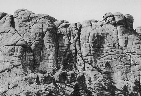
Have you ever been to Mt. Rushmore? I hadn’t. It’s terrific. It looks just like its pictures, except heavy, as in tonnage, as in a million tons of granite looming overhead. That’s awesome. But part of the experience — and this was captivating — came with the realization that once upon a time the great stone faces weren’t there. This means a designer was involved. It’s obvious if you think about it; it’s just that I never had.
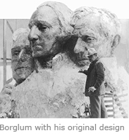
Before 1927, Mt. Rushmore was a natural mountain, extremely old, extremely hard, well situated, and blank. But where others who looked at it saw a big rock, sculptor Gutzon Borglum saw — imagine this — a blank page. It was to be his calling; he would spend the rest of his life blasting the titanic faces of four U.S. presidents out of ancient granite in South Dakota’s beautiful Black Hills.

I’ve designed thousands of pages in my career and never have I gotten one right the first time. This used to weigh on me; the designs I admired always looked so easy, so smooth, so done. Other designers were gods. Me, I’d toil over an ordinary page, pushing and shoving, feeling clumsier and more anxious by the minute, one eye on the clock, wondering how they did it, just certain that it was easier for them.
But it isn’t. The designer may start with a vision, but the labor — the carving it into the rock — is a process of trial and error that slowly but inexorably bends to reality; like the format that works as a mockup but doesn’t fit the copy.
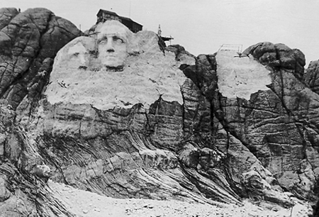
It’s like this for everyone. The Mt. Rushmore we know today — this American icon — was not Mr. Borglum’s first design. Nor was it his second, nor even his third. For 14 years he adjusted his models for what the rock and his artistic eye would allow. He fussed and he cussed and he made tries that failed. His original vision had Jefferson on Washington’s right, but he began carving against engineering advice that the


rock there would not hold. When his crew was stopped by the bad rock, he — aarrgh! — did the only thing possible: he set dynamite and blew his baby out of America’s history books.
That’s how it goes. On the mountain, on the computer, it’s all the same. The greats are the ones who don’t give up.


“The greats are the ones who don’t give up.”
Well said.
Just the push I needed. Well said and thanks!
Very inspiring — and comforting that all of us go through that same frustrating process. I have felt the same way many times — that other designers were gods. Recently I had the opportunity to work with a very well known and experienced designer in my area, and I was pleased to see she goes through the same process as I do — there is no set formula, just lots of “let’s try this.” As you say, perseverance is what brings great things. Thank you.
Thanks John, that’s made me feel a lot better. I am a newly graduated designer and was trying to design something yesterday, and nothing was working. I was having thoughts wondering if I should have done the design course at all, and how others’ designs look so good, etc., etc. — it was very frustrating. It is comforting to know that most designers go through this.
John, do you have any tips for those who feel they have a mental block, and are perhaps struggling for inspiration?
John, your perspective gives me hope. Thank you for your expertise and heart and soul that you put into everything you do.
“. . . the carving it into the rock — is a process of trial and error that slowly but inexorably bends to reality . . .”
Sounds a lot like life, doesn’t it?
Ever since I took the sage advice from my wife — to enjoy the process as much as the end result — I have found design to be a rewarding and fulfilling adventure from start to finish, even if I do curse on occasion.
Thanks for sharing your thoughts, John.
Gosh that’s great. Timelessly motivating. Thank you.
Thought-provoking article, as always.
I find your comment about “other designers” being “gods” interesting, because being a subscriber of Before & After magazine for many years now, I still feel that way about your publication. Keep up the great work!
Thanks for the reminder of how hard it is and that nothing comes easy when you are a designer. And thanks for visiting South Dakota! Nice to read about an outsider’s visit to our state.
I’d echo Mickey’s comment. I also have to say that this article made me realize that I’m probably a better designer than I give myself credit for.
However (as they say at despair.com): “Winners don’t quit. Quitters don’t win, but those who never win and never quit are the real idiots” :-)
Wow. The old saying that genius is 1% inspiration and 99% perspiration is so true. And most of us are trying to wrestle the perfect-design alligator out of a computer with Adobe or Corel (or whatever) software, not blasting out solid granite with dynamite!
That was inspirational and so are you, John . . . much appreciated.
Excellent advice. The design process has to be just that — a process. Once you as a designer are comfortable with that, your life becomes a lot less stressful.
For me, the realisation came along with two others:
I will never be as good as I want to be, but I will keep trying anyway.
I should forget about using the latest cool style/font/technique/filter in every project, but use those appropriate for the client.
Wow — that’s actually quite incredible. I honestly thought I simply belonged to the lower echelon designers that simply take too long to come up with anything good.
Admittedly, some ideas do come about very quickly and work well right away, but the majority of time designing feels like a major trial-and-error workout. I always knew that persistence is omnipotent, but sometimes, I guess, you just second guess yourself . . .
Thanks a lot, John, for this great post!
To Joseph and others . . . just keep plugging away.
I find that looking at the work of others is very helpful.
When I’m stuck and working on a landscaping flyer/brochure . . . I look at others that I like, or that the client brought to us.
The same goes for any project any of us are stuck on. It’s almost always the way to go — that being, to work off of samples clients bring in. They often bring in items that caught their eyes, and designing something close to what they brought in often makes your life easier.
If a client likes a theme, color, style, layout, then don’t rock the boat; work with it.
Dynamite! The “command-z” of the 1920s!
I think the title says it all . . . “An eraser of dynamite” . . . the success of a design is dictated by the creativity of the approach.
Inspiring and a much-needed read!
It’s strange, but your story made me think mostly of the issue of pollution : o) — like, the impact on the environment of the crafted and skillfully made designs (inks, papers, plastics . . . the lot.)
Very inspiring and really hits home. The fact that all of us truly go through that same frustrating process is comforting. I know I have many many days when I question myself, my work and why it takes so long!
“The greats are the ones who don’t give up.”
Thanks for that.
Wow John — thanks for your commentary. I read Before & After religiously — everything looks so simple, so clean. When I start a website design I have an idea, then it evolves, then it gets muddy, I feel stupid — why haven’t I learned enough from Before & After? But the design keeps evolving.
To be honest — I thought that was just me — and that I should find another specialty. Now I can have more confidence that it’s just part of the process.
Thank you for this piece. I feel less alone in my neurotic struggles to lay out each and every page.
Incredibly inspiring! I’m a new designer, fresh out of school (Sessions College), and sometimes my confidence is shaken because I keep being seduced by the “myth” that experienced designers don’t labor . . . that creativity comes easily the longer you practice. Thank you for removing the scales from my eyes! With all due respect to every designer in the room . . . I’m comforted to know I’m not the only one here who labors for the prize!
I started my career back in the dark ages of darkrooms, stats, typesetters, etc. Today’s designers have the curse/blessing of tools that allow exploration of (sometimes too) many options with just the click of a button. Faster and funner.
Dear John,
I have found in my short “career” as a designer that it is sometimes better to “blow it up” and start over with a new concept than to try to fix a design that just isn’t working! Thanks for your web site and publications. They are so helpful.
Persistence is a required asset for designers and for any success. I like Winston Churchill’s speech to a graduating class during the war years — “Never quit. Never quit. Never quit.”
I practice that today!
Wisdom indeed, John.
The day, years ago, that a total master of his craft confided to me, “I always feel completely stupid the first few days of a new project,” I stopped worrying that I did, too. Doesn’t stop the stupid feeling, but it does mean I don’t fret about it.
We aren’t alone, either: Frank Lloyd Wright famously remarked that his two most useful tools were an eraser in the drafting room and a sledgehammer on the building site.
Going to look at this differently when I visit Mt Rushmore early September 2010. Coming from New Zealand going to Yellowstone too.
I’m so grateful for this subscription. Mr. McWade, thanks for re-running this. Lots to think on, and appreciate. And I’m grateful to all you comment-makers, who said what I felt before I could type it. It’s amazing work that we attempt, whether in stone or on paper or on screen. Lucky to get to “play with the crayons,” digital or wax. Enjoy the befores and the afters, everyone. And thanks.
Nice article. Taking a month-long roadtrip to see the country is on my “bucket list.”
Great article. Might I add to your comments the words of Samuel Beckett:
“Ever tried. Ever failed. No matter. Try Again. Fail again. Fail better.”
Mr. McWade,
You sir, are inexorably gifted. Your struggles give insight to everyone wanting to perfect their craft. As a 17-year, isolated freelance, Before & After serves as my water cooler. This simple story gives everyone the hope of achieving perfection. I thank you.
This story reminded me of this quote by Michelangelo:
“I saw the angel in the marble and carved until I set him free.”
Thank you for keeping “Before & After” alive. It has been my very favorite design reference for many years.
Dear John,
What a pleasant surprise to to see this article online. This very story inspired me back in 1993 when I found out about Before & After while living in Boston. I use this story — giving you credit — to this day.
Congrats, and thank you for all these years of inspiration. Long live B&A!
:-)
Absolutely!
“Everything looks messy in the middle.”
No matter what the project — a cake, a sculpture, a painting or an electronic newsletter — it always looks MESSY in the middle of the project.
A fitting analogy, John . . . inspiring!
A really inspiring read. It’s comforting to hear from so many that the feeling of frustration is sometimes a necessary signpost on the road to perfection. I wonder, though, if I am the only one who feels that “hum” when you’ve pulled out of the “messy middle” and know you’ve got a winner?
Well, John, you’ve done it again!
As always, it’s very inspiring and so amazing to hear all of the other hard-working designers out there experiencing the same problems, frustrations and doubts.
I recently had to do a yearbook for a college, and it took me a couple of months more than I wanted to simply because I refused to give up. Needless to say, they didn’t ask me to do the next one, but I am satisfied that I never gave up, and the end product was worth every tear I shed and hair I pulled out.
I have had only compliments, but, unfortunately, to survive in the design world one has to be cost-effective, and that means you have to learn to get designs done quickly. (By the way, they never gave me a deadline, so I just plodded along until I felt it was time to finish.)
I learnt so much about the programmes I was using, and I would do it again if I had to — sucker for punishment? . . . or determined to succeed?
John, this website and ALL of the positive contributions have been the best thing that could have happened to me as a designer.
Thanks again, and thank you to those who have a real spirit of camaraderie.
Keep up the good work and stay inspired!
I still haven’t discoverd the magic potion for “quick designs,” but I know that reading Before & After helps to improve on my skills.
Tanti Saluti
A very real and inspiring read. Thank you!
Thank you. I’ll try to remember this when the going gets tough. It doesn’t help that most creative people are perfectionists by nature.
Years ago, traveling in Europe, I went to the Matisse Museum in Nice. What an eye-opener, because on display there were sketchpads full of discarded drawings. Scribbles, erasures, awkward, unfinished works-in-progress. That’s when I realized not every work springs finished from the hand of the genius, and not every work IS a masterpiece.