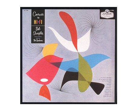
My day’s design-history education started this morning when the following note arrived from subscriber Judy Robertson . . .
Hi John, I just spent the afternoon with Alex Steinweiss. He is THE MAN who first put graphics on album covers. I sat looking at his book with him and was totally blown away.
Design in its purest form. Before computers. Before Pantone colors. Before using cameras. He lives here in Sarasota and is 93. It was an honor for sure. 400 pages of “wow.” There wasn’t one page I looked at that I thought, “I wish he would have done it this way.”

It was a huge lesson for me in design. And I felt like I was in an episode of Mad Men. Just wanted to share this with you. Your readers would gain a lot by just looking at this man’s art.
—————
From the Web site . . .
Alex Steinweiss invented the album cover as we know it, and created a new graphic art form. In 1940, as Columbia Records’ young new art director, he pitched an idea: Why not replace the standard plain, brown wrapper with an eye-catching illustration? The company took a chance, and within months its record sales increased by over 800 percent. His covers for Columbia combining bold typography with modern, elegant illustrations took the industry by storm and revolutionized the way records were sold.
Over three decades, Steinweiss made thousands of original artworks for classical, jazz, and popular record covers for Columbia, Decca, London, and Everest; as well as logos, labels, advertising material, even his own typeface, the Steinweiss Scrawl. He launched the golden age of album cover design and influenced generations of designers to follow.
—————
I love this stuff.
I didn’t ask Judy how she scored an afternoon with Steinweiss.
.


Can you imagine how cool it would be to be remembered as the person who started an epic trend, such as Alex did?
Album art seems like it should have been the norm right from the start, but I guess one has to be old enough to remember when that wasn’t the case. I don’t think I can remember the first album cover that made its mark on my memory, but I suspect it would have been something released in the 70s.
Although I am not that keen on Alex’s style, I can sure appreciate the effort that went into all those covers and labels. Way to go Alex!
Also an amazing integration of type with design. So much character with relatively few face choices.
To my embarrassment, I have never before heard of Alex Steinweiss, but I immediately recognised the covers from my growing-up!
The covers are, I think, wonderful. They are so elegant (look how uncluttered most of them are) and so much of their time: Kandinsky, Miro, Picasso and others, I am sure. Anyone else remember W.A. Dwiggins and his stencil shapes that you play around with forever making designs?
I love the cover for Bing Crosby album “Bing.” All of Crosby except his face. Very clever!
It’s amazing that we take something like the album cover for granted as if it’s just always existed. Very cool to learn about this man’s artwork. Thanks.
Wow! Amazing covers. I would like to know how Judy scored that afternoon!
It’s odd that while sheet music of the early 20th C. had really colorful, interesting designs, no one thought of doing the same with Victrola record album covers.
Incredible artwork and inspired design — sans computer!
Would love to see an interview with Mr. Steinweiss. What a privilege it must have been to spend time with him.