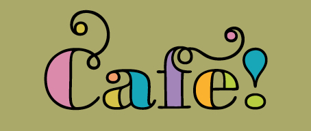
Responding to our recent post about the LiebeDoni typeface and InDesign’s Glyphs feature, reader Jackie Ponderosa asked what tool or feature we used to color in the fonts to create the stained-glass look. Of course, different software will handle this differently, but it’s easy in InDesign.
Set your type in LiebeDoni Outline . . .
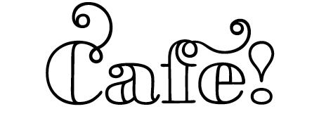
Select the text frame, then go to Type > Create Outlines, which changes the type from a font into a drawing . . .
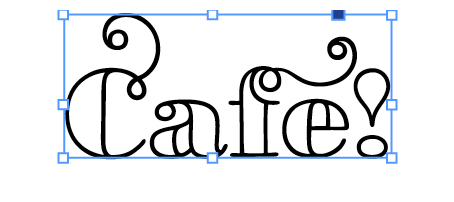
Go to Object > Paths > Release Compound . . .
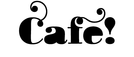
Click on each filled shape, then color . . .
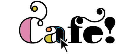
This works for any typeface.
In Adobe Illustrator, the sequence is . . .
1) Select your type
2) Go to Type > Create Outlines
3) Go to Object > Compound Path > Release
4) Color
30% off
Remember that Ulrike is offering Before & After readers 30% off on LiebeDoni through the end of September. Enter bamagazine_30% in the gift code field.
A free, printable Extra of this article is available on our Web site.


A critical step at the end of all of this is to “punch” the voids/counters back into your letters, or they will not be transparent against background colors. To do so, make sure the “hole” is in front of the body of the letter, select both items, go to Pathfinder >> Subtract. This will rejoin the two items and make the void transparent again. I find it easiest to make sure the voids are white before I begin, so that I don’t lose any, especially with detailed scripts. (Please note that often the void in the letter, once you’ve released the compound paths, will be behind the body of the character. Have never figured out why some are in the foreground, and others in the background.)
I must be doing something incorrectly, because when I follow the InDesign (CS5) steps, Object > Paths > Release Compound is greyed out. The technique works perfectly in Illustrator. Any thoughts?
Select your type with the pointer tool, not the text tool.
Thank you! Worked like a charm
Why create extra steps? Don’t release compound paths, and the “voids” in the letters will always be clear/transparent. Whatever background the type is placed over will always show through. In my experience, this approach seems more useful in a majority of situations where type is placed over a background. There are far fewer instances where the interior holes in the type will need to be opaque, or a different color, and those can be dealt with using the described method. Efficient use of time is the goal here.
You’re correct — for most typefaces. But LiebeDoni is different; it has dozens of color-able spaces that can be accessed only by releasing the compound paths, which, of course, releases the voids, too.
So now that I have followed these steps and colored the text, how do I get out of this to resize the text? I can’t get my text box back.
Converting your type to outlines changes it from text to a graphic, so it can no longer be edited with text tools. To resize it, treat it as any other graphic.
Maybe my InDesign program has a flaw but I cannot get a graphic’s box for the text that I converted. When I put my cursor over the text it only highlights each individual part of each letter.
You’re probably using the direct-selection tool (the hollow arrow). Highlighting each individual part is its job! Change to the solid arrow, marquee your whole word, then Group it.
John McWade, YOU are a star! And although I have never participated in these posts before, I’d like to take a moment to say how much I appreciate your talent and communication style and willingness to share both. Please don’t ever stop!