Re: Color type in three easy steps
Reader Johanna took Wednesday’s Design Talk post one step further than we did. In coloring our letters after releasing the compound paths . . .
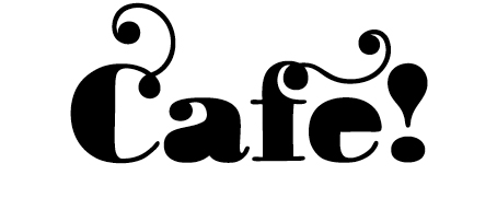
. . . we filled the voids with background color — in our case, white . . .
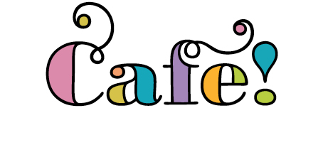
. . . which works fine. But if we then change the background color . . .
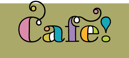
. . . the voids must be recolored, too. This can be avoided, said Johanna, by making the voids transparent, as follows:
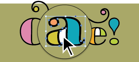
(InDesign) Select a void and bring it to the front. Then shift-select the void and its letter outline, and go to Pathfinder > Subtract . . .
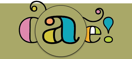
. . . which rejoins the two items and makes the void transparent again.
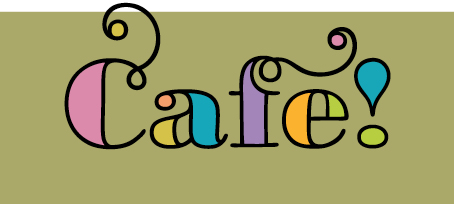
“I find it easiest,” she concluded, “to make sure the voids are white before I begin, so that I don’t overlook any, especially with detailed scripts.”
Thanks, Johanna!
—————
Susan Childers asked the name of the “cute font” in the subhead.
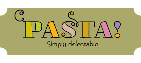 The font is Tweed. It goes really well with LiebeDoni because it has similar full, round shapes, similar line weights, and a touch of whimsy.
—————
Tim, who said he bought LiebeDoni to use as a title font for a CD project, asked if we could recommend a second font that would go well with LiebeDoni — “something readable that could be used for the body of the text. (Maybe Bodoni itself? Or might a sans-serif be preferable?)”
The answer has everything to do with the subject matter and tone of the CD and how much text there is.
His choice of LiebeDoni suggests a playful design, or at least informal.
The face to not use is Bodoni. Two reasons: 1) Bodoni’s super-fine serifs tend to disappear at text size. 2) Bodoni conveys stateliness, elegance, and glamour, all different from LiebeDoni. The two are incompatible mainly because each has too much presence but of different kinds.
There are countless typefaces that will work. For informality, try Tweed (above) or ITC Highlander (below). Look for typefaces with full, round letterforms and line weights similar to LiebeDoni . . .
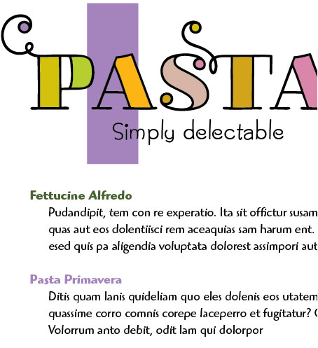
(Above) ITC Highlander text
As with most display typefaces, LiebeDoni will play well against plainer, low-key fonts. A good example is Avenir (below), which meets the shape and line-weight requirements and also has a wide range of weights . . .
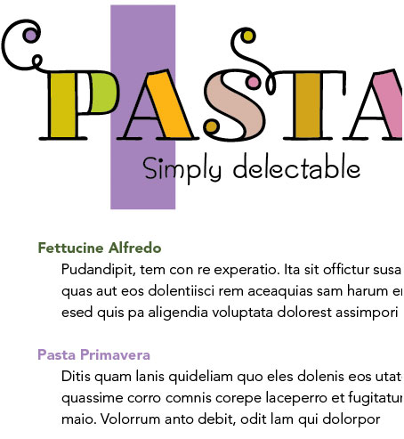
(Above) Avenir text
Avenir is an unusually clear, simple typeface that will not steal the show.
Generally speaking, avoid fonts that have strong “personalities” or shapes or other distinctive characteristics that compete with your primary type. In this case, most serif fonts will also compete by adding too much detail, so for LiebeDoni we recommend sticking with sans-serifs.


