Have you ever worked on a logo and tried to endow every line and shape with meaning? You can almost hear the committee barking: “It needs to have pow! Be sure to represent our financial strength! Don’t forget our great customer service! Give it a sense of our history! Let people know we’re number one! Gotta look professional! Oh, and we like blue!”
How did it turn out?
Beautiful, simple, and clear?
Or corny, complicated, and confusing?
The following post by designer Michael Bierut of Pentagram may be instructive. Writing on his blog, Design Observer, he tells this story:
“A while ago, I was designing the identity for a large, fashion-oriented organization. It was time to decide which typeface we’d use for their name.
“We decided to recommend a straightforward, sans-serif font. Predictably, this recommendation was greeted by complaints: it was too generic, too mechanical, too unstylish, too unrefined.
“I had trouble responding until I added two more elements to the presentation. The first was a medium weight, completely bland, sans-serif C . . .
“ ‘Does this look stylish to you?’ I would ask. ‘Does it communicate anything about fashion or taste?’ Naturally, the answer was no.
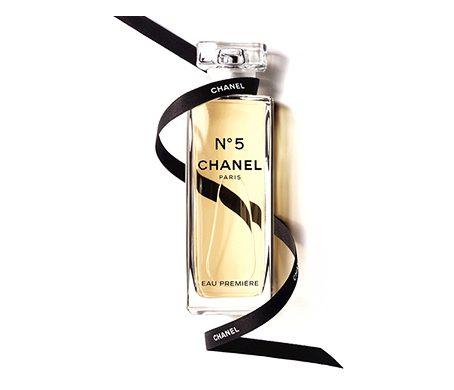
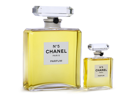
“Then I would show the same letter as it usually appears as the first in a six-letter sequence: CHANEL. ‘Now what do you think?’
“It worked every time.
“But how? The answer, of course, is context. The lettering in the Chanel logo is neutral, blank, open-ended: what we see when we look at it is eight decades’ worth of accumulated associations. In the world of identity design, very few designs mean anything when they’re brand new. A good logo, according to Paul Rand, provides the ‘pleasure of recognition and the promise of meaning.’ The promise, of course, is fulfilled only over time. ‘It is only by association with a product, a service, a business, or a corporation that a logo takes on any real meaning,’ Rand wrote in 1991. ‘It derives its meaning and usefulness from the quality of that which it symbolizes.’ ”

Michael’s post continues, but of course you get the point.
Instead of trying, usually in vain, to squeeze meaning into every element (“this line depicts the upward thrust of success!”), chill out, present a simpler image, and let the market do its work.
Does this mean that any old typeface will do? No, it does not.
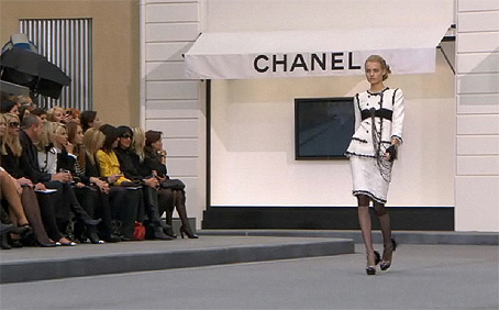
Coco Chanel, who rose to fame in Paris in the cross-currents of post-Victorian France and World War I, chose her plain, gothic typeface as deliberately as she designed her anti-establishment fashions, like flannel blazers, sailor blouses, and straight-line skirts. Similar to today’s Gotham, her font championed her straightforward, practical, and faintly masculine aesthetic for the new working woman, a radical departure from flowery, corseted Victorian girlies.
 Photo by Christopher Macsurak
The juxtaposition — industrial type on women’s apparel, even perfume! — is what gave Chanel a new and powerful presence.

How simple it is!
What can we take away from this?
1) Distill your message to its essence. Take as long as you need. All of those competing demands can surely be summarized in one clear statement.
2) Design simply.
3) Simpler than that.
4) Apply consistently.
5) Let the quality of the product build the brand.


Very true: Too few clients are really aware that the quality of their services and products defines their logo’s associations. Many believe that the new logo will do the job all on its own!
And [Chanel is] yet again another fine example why some designs last longer than others. ( . . . although the well-designed products wouldn’t shine as much if there were no bad designs! I always like to say: “Even the bad designs serve to maintain the values!” ;-)
( . . . and his name is “Bierut,” not “Beirut” . . . )
( . . . and his name is “Bierut,” not “Beirut” . . . )
Right you are, he said sheepishly. Thanks for pointing out the error. Correction made.
Firstly, I’m a big fan of Michael Bierut. Every designer (ok, everyone else, too) should read his book Seventy-nine Short Essays on Design. Buy the print version; the Kindle one loses a lot of subtly with the medium being the message.
#5 above is the hardest thing for companies to grasp. Many just want to slather lipstick on a pig through a logo redesign without fixing the underlying problem. JC Penney’s Fair and Square comes to mind off the top of my head.
I like when you describe type in practical terms. It is like listening to Guy Fieri, Bobby Flay or Alton Brown describe food and why it produces the human reactions it does. “. . . font championed her straightforward, practical, and faintly masculine aesthetic for the new working woman, a radical departure from flowery, corseted Victorian girlies.” If every designer developed that skill alone, there would be a whole lot less “poo-flinging” and client-led logos with typeface use that misses the mark.
This might be the poster child of what not to do.
Whoa! That’s really an eye full! I assumed the rotor was the circle thing in the middle . . .
Wow! It’s like the sign on the Twin Oaks tavern in The Postman Always Rings Twice. Since reading about the sign, I refer to those clients as “Nick”.
Exactly.
I’ve worked on so many projects — not so much logos, but on websites — where every page has to have elements of all of those things you mentioned and sometimes more, all competing for attention. It’s maddening.
Oh . . . but we can fit that in that one little spot of white space that we have left!
John, you say,
Any suggestions on how to do so?
I’m not asking for a list of steps; more like potential questions one might ask, or types of brain-fog to watch for and how to blow it away. I’ve been trying for years to synthesize that one clear statement.
I think, Christine, that I’m thinking of questions almost at the soul level. Like,
1) What do you know/love about yourself that no one else knows?
2) What do you live for? Why do you make what you’re making?
The best logo is the one that you make for yourself. It’s the one that reinforces you to you. Not “target audience” or “marketing” or any of that facade-speak. It’s just you. Put it out there, and the world will adapt to it.
Chanel had a vision, an internal compass, out of which came her logotype.
It goes without saying that it must also be beautiful, simple and clear.
Point well taken John.
I had a similar experience with a client. After the initial discussion, I researched and presented a dozen internationally recognized fashion logos that all were created with sans-serif fonts to validate my assertions. Michael’s tack is simpler, and more direct.
I don’t design logos, but I know a good one when I see one.
Yes for Chanel.
The UEFA Euro 2012 logo does NOT work for me. Saw it this morning, opening match. Way too complicated.
I agree. I also don’t understand what it’s supposed to mean. The London Olympics logo is equally hard to understand. Can anyone shed some light on it?
Yes, doesn’t work for me, either, but I can help with its meaning: It is a folkloric model of a flower, which can be found on Ukrainian national costume or other decorations, as well as on the Polish costumes and ceramics. Was a very nationalistic approach, a bit too crowdy and too cartoonish for my taste.
Yes, simple is always better if it is distinctive, memorable, and accurate. Check out this logo design in the Black Angus insemination business.
Oh, WOW. Now THAT is a memorable logo. :)
Wonderful, easy to understand! It’s also something that can be used across multiple platforms.
This post is the story of my life right now. Though sometimes my gentle attempts to steer clients toward simplicity in their visual communication is met with, “Yeah, I get that, but this is how I want it anyway.”
Sometimes people are hiring a designer to design, and sometimes they’re hiring a designer for their ability to use design software.
Amber, please don’t take this the wrong way, but most clients think they are hiring a designer to implement what they think up rather than to do the thinking for them. And most designers allow the clients to do this to them by not setting clear boundaries. For the clients who insist on using designers as a pair of hands, the next action by the designer should be thanking the client for their time and then referring them to 99designs.com, where they will find a whole pack of “designers” more than happy to be just a pair of hands. Effective designers are both head and hands.
If you haven’t already, another good book to read is Design Is a Job, by Mike Monteiro. He and Michael Bierut should be essential reading for any designer who wants to survive and thrive going forward.
No offense taken; I agree completely! Though until a designer has as much work as they want, it’s difficult to turn down well-paying work or work for clients they want to keep.
A couple of designer friends of mine fill in the gaps in their workload with Photoshop work, but there’s no frustration because they’re not expecting to “design” anything for that client. The difficulty arises in cases where one’s expectation (“They’re hiring me to design something”) doesn’t match reality.
Thanks!
Hear, hear! (nodding enthusiastically!)
The issue that businesses often have is that they see their logo and associated marketing themes as their brand.
The things that determine a brand are the things that the customer experiences at every point of contact with the business, and the brand is what the customer eventually believes about the business. What you do speaks so loudly that your customer cannot hear what you say. Think of a poor customer experience you have had and ask yourself what is the “brand” of that business in your mind. Does it outweigh what they tell you it is?
Managing a brand involves a lot more than design, sales, or marketing. It involves some very introspective analysis and real effort toward matching what you say with what you do at all levels.
Thanks for this article — loved it!
Leonie
Simplicity is usually the way to go, but not always. It really depends on the company, and even on the design era. Billabong and the other surfing brands can be simple but are often complicated. On purpose. Are we just talking logos here? Or also advertising and design? A logo usually should be quick to read; even the complicated, stylish ones that go on t-shirts often have a simpler version.
I guess you want some examples, huh? Saul Bass designed a wonderfully simple logo for Warner Bros., only to have them return to their old mark a few years later. Metro Goldwyn Mayer also had a simple logo designed, of a lion. I loved it, but they ultimately returned to a juiced-up version of their classic logo from the 1930s, with lots of gold film thrown at the feet of their names. More complicated logos? How about Harley-Davidson?
I guess I’m just saying, usually, yes, but! — it all depends on context.
BTW, the post is missing a quotation mark before “We decided.”
Correction made, thank you.
First, I must say that is a wonderful example with the Chanel logo and the letter C. People understand better with visuals. Perhaps rather than getting upset at people for not agreeing with us, it may be more productive to work with them. Understand that they don’t have the training you do. And enlighten them. Perhaps with examples and analogies.
Simple is better. Why?
It’s easier to remember one element than many. Too many elements fight for visual attention. Memorable makes it recognizable.
Imagine walking into a crowded room. Will you remember all the people? No, all the people will be fighting for visual attention. Each person entering that room will come away with a different visual impression.
Then imagine walking into a room with one person. Will you remember the one person? Probably, and each person entering that room will come away with the same visual impression.
As John and Bob said, part of creating a logo is including the company’s personality. A san-serif might be better for some, while a script may be better for others. Consider Barbie verses Chanel. They are both female products, yet they differ in style; both convey their company’s personality, while both are simple in design.
Showing examples of your simple version for their logo, contrasted with their loud, busy, cluttered version, with an explanation of why one works and the other doesn’t, might help get the point across. (Note that I said “might.”)
Chanel is a perfect example! Even just seeing the C reminds me of Chanel. Talk about memorability!
What was for me the living proof that we are talking about memorability was that I thought about Chanel, reading the lines and seeing the spartanic, simple “C”. Thanks for another inspiring article!