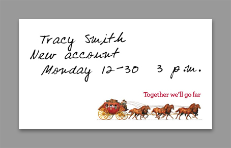
The last time I was at the bank to make a deposit, I got chatting with my teller about unrelated business, and pretty soon she was setting up a meeting with branch-manager Tracy for me to discuss opening a new account. As I left, what interested me was not the new account but the back of her card, on which she’d jotted my meeting time (below). Back to this in a minute.

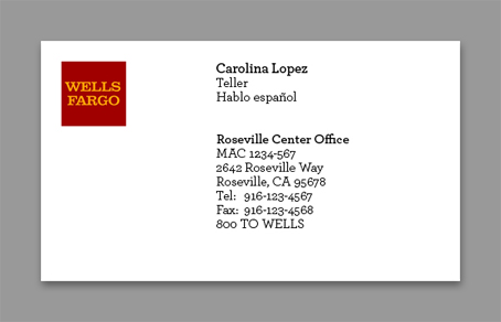
The front of the card (below) was less interesting — logo in the corner, and type in a single column that’s not quite centered, just close enough to render the white space inactive, which makes the card feel vaguely dead. We might call this look “corporate spare.” It’s practical, though, in two ways: 1) type in a column makes it as easy as possible to whip up a card for a new employee, especially with so much room on the right for long lines, and 2) it frees up the back side for other things.

Archer, a beautifully homey typeface designed for Martha Stewart Living magazine by Hoefler & Frere-Jones, is a curious choice for a bank, especially so tightly set, which gives it a dense, industrial feel contrary to its warm, relaxed vibe (slab serifs, ball terminals, small x-height). Perhaps Archer was an attempt to warm the austere card, but the 8-point setting is too small to do that; Archer’s quirky style needs size and subject matter to convey its effect, which is more at home in a context like, well, Martha Stewart’s . . .
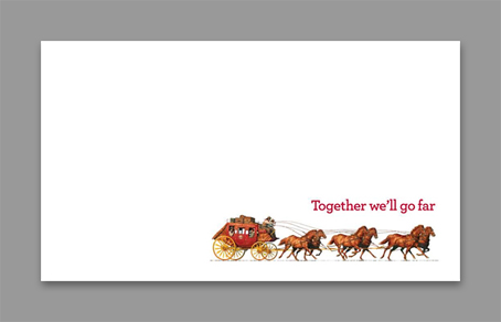
What I like is the back (below), which isn’t blank, but instead of more information (address, web site, and so on), it carries the bank’s slogan and mascot stagecoach in the lower-right corner, leaving plenty of room for notes:

The effect is subtle but surprisingly strong. If the back remains blank, the graphic works as a bit of artistic lagniappe — a little something more — that softens the card and rounds out the bank’s message by giving it a second, complementary voice. And if you write, you’ll be spending 10, 20, 30 seconds in the presence of the artwork, almost literally on top of it, which is as long as a commercial. That’s a significant impression.
You can put artwork like this anywhere on the page. The lower-right corner is the natural exit and a strong choice, but a different image will work in different places. Just keep it subtle.
—————
Those of you with the Before & After Master Collection will find a similar idea for a giveaway notepad — using a lightly ghosted image instead of a blank page — in Design Talk article 0619.


Hi John. I enjoy reading your articles. I’ve been reading your magazine since the beginning.
I too was handed a Wells Fargo card at the bank a few years ago and noticed how cool the artwork was on the back, quietly referring to the past. But I respectfully disagree about the font. The chosen font also has a subliminal historical reference. That font may or may not have been around in the 1800s, but it does have that feel. For someone who grew up on westerns, I love going into the bank and seeing that font on the wall behind the tellers, and in the mail I receive from them. In a world where Helvetica and Times and all their lookalikes give the impression that all graphic designers graduated from the same institute, it’s good to see someone dare to be different, even if it’s just a font.
Hi Nancy!
Are you referring to the Wells Fargo logo? That is set in Clarendon, a slab serif that is associated with the American West (among other things) but came from England in 1845.
My reference was to Archer, the text typeface on the front of the card. It’s new.
I love the back.
I’d also love to see how you would give the front a makeover, John. How would you change the font and the position of the text?