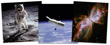
It was brought to my attention not long ago that NASA (National Aeronautics and Space Administration) makes its immense library of photographs available to the public copyright-free. There are a few restrictions in some cases, so you’ll want to read the fine print, but if you’re a space buff, this discovery is right up there with finding life on Mars. The archive is fantastic.
So much is here, from the earliest days of the space program through the moon landings, the Space Shuttle, the Hubble Space Telescope, the International Space Station, the Mars missions, interplanetary probes, and everything in between, up to the minute, at high resolution. The gamut runs from the famous to the prosaic (like press-conference shots) to deep-space images so spectacular they seem like phantasms.
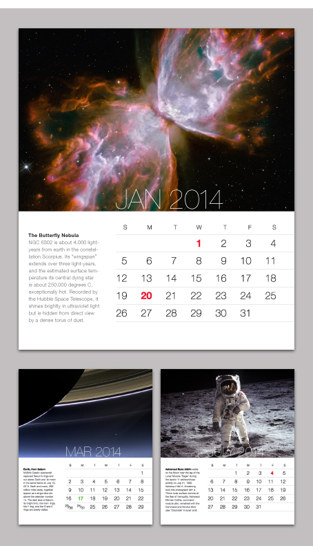
What to do with all this stuff? First thing I did was make a nice calendar for my desk.
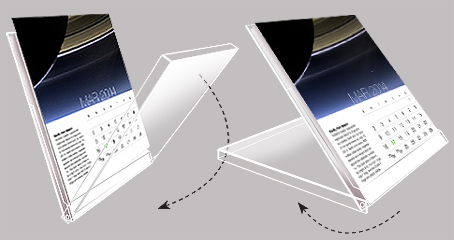
Its pages fit into one of those purpose-made, fold-back CD cases (below). Run card stock through the office printer, cut to size with a razor and straightedge, and stack them in the case. It’s inexpensive, good-looking, and easy.
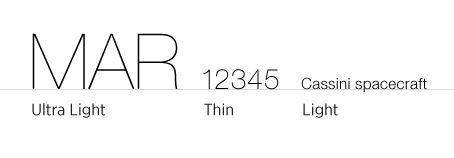
The calendar can be designed in countless ways, but the subject matter lends itself perfectly to sharp-edged minimalism, cold and spare, like outer space. I used the Helvetica Neue type family in three similar weights — Ultra Light, Thin, and Light — plus bold. The purpose of using three is so the type looks the same in every size — the smaller the size, the heavier the weight (below). Without this adjustment, the large sizes would appear too bold, or the small sizes would appear too light. For a similar reason, the letter spacing of the smallest size has been increased (tracked) by 20%.
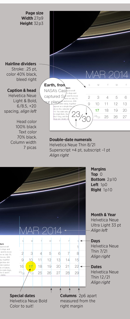
Limiting the calendar to five rows of dates meant occasionally doubling up some dates, for which I used carefully sized super- and subscripts. I set special days, from national holidays to family birthdays, in bold plus color; green for St. Patrick’s Day, for example. And I chose to include NASA’s captions, which are very instructional, often quite long, and obviously written by space enthusiasts. All required editing for length, which for looks I made identical for every month. This in some cases required rewriting.
Below are the specs:
The NASA site is not the most intuitive you’ll ever see, but everything you’ll want is within a link or two. I hope you find it as interesting as I did!
———————–
We’ve covered the CD-calendar topic before, briefly, in Before & After. Those of you with the Master Collection will find it in article 0620, page 5. The rest of you can get it here.


Wow! You’ve inspired me to create a calendar from all those iPhone photos I take of my dogs (yeah, it’s a bit embarrassing but I justify it by saying it is content for my blog DogWalkBlog.) Thank you.
Relative to copyright-free images, any images that the government paid for are regarded as copyright free due to the fact that our tax dollars paid for them. There are some exceptions due to specific contracts with the photographer/artist, but most are available for use. Relative to outer space images, some of the Hubble pictures are fantastic. The links are:
http://antwrp.gsfc.nasa.gov/apod/archivepix.html
http://heritage.stsci.edu/gallery/gallery.html
http://hubblesite.org/gallery/album/galaxy_collection/npp/all/
On other type of images, a good government site is the “Prints and Photographs Reading Room (Library of Congress).” The link is: http://www.loc.gov/rr/print/
There are great images from the early 1900s. Photographers such as Ansel Adams were contracted by the government to photograph various places, people and events.
Neat calendar!
Great stuff, thank you!
Thanks for your article as always… I liked the idea so much I read the article again looking for a download link for your space calendar… alas not to be found.
I’ve been a fan of NASA’s imagery since forever. They’re often stunningly beautiful, as you’ve noted, but one can have fun with them, too: Life on Mars — Proof!
Loving the tutorial idea of the calendar.
Could I ask a rookie question and ask what the 7/21 and 12/21 are in relation to the font?
I can see that in the first example “7” is 7 picas, but what does the second number represent?
As always a great tutorial.
Thank you,
Kirk
Hi Kirk,
The second number is vertical line spacing, the vertical distance between lines of type. 7/21 is widely spaced.
Hi John,
Thank you for the clarification on the meaning of the numbers.
I now understand.
Thank you for your time.
Regards,
Kirk