A copy of Glamour magazine landed in our mailbox recently, and after checking out Keira, I went right to the type. Looking at magazines is how I learned typography, so this was as natural as breathing.
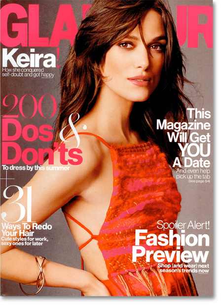
What caught my eye was this . . .
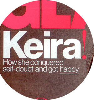
. . . the word Keira in upper- and lowercase Helvetica-ish bold, spaced as tightly as we did it in the 70s. Tight is the best way set Helvetica, and, as with all typefaces, some letter combinations look better than others. Keira is especially nice — it’s short, with angles, curves, and verticals in a sequence that fits snugly without leaving gaps. The arm of the “r” has been shortened to accommodate the “a”.
When I say it’s tightly spaced, compare it to the default spacing of Helvetica Bold . . .

. . . which is how you’d see it at text size, where the wide spacing is needed to create separation (tiny details would run together otherwise). At headline size, however, the letters stand on their own, so to restore interaction, tighten the space. Global spacing is called tracking, after which you manually kern each letter pair for the best fit. Set as tightly as Keira (below) is a design decision, not a readability issue.

Nice as that is, all is not well in Spacingville. The small Helvetica Light deckheads are too tight, as though the designer merely reduced headline-size spacing without relaxing the tracking. The congested result:
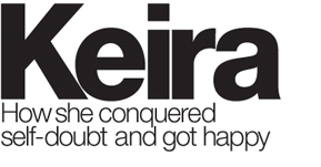
The deck should look more like this. To match the vibe of the extra-tight Keira setting, the spacing should be slightly tighter than this, but screen resolution won’t allow me to adjust that fine (for that you need print!) . . .
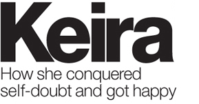
Also catching my eye was the light, pink, Didot-ish bang, or exclamation point . . .
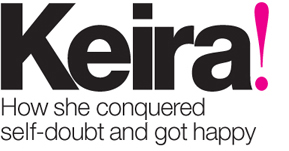
It’s an unusual but fun juxtaposition of styles. Would you have thought to do it? Maybe, if you were working in Glamour’s two typefaces — a Geometric very similar to Helvetica, and a Modern similar to Didot — in the pink-and-white, mix-and-match style that we see on this cover. The thing to note is that the type is pure: no shadows, outlines, gradients, no parade of colors, no tricks of any kind. The designer relies on the design of the type itself for the exuberant results. I’m a big fan of this.
It’s far from the best cover I’ve ever seen. What I like, though, is the Keira setting, the simplicity of two colors (pink and white), and the mix-and-match technique, all of which can be transferred — you can do it better! — to other projects.


It’s beautiful typography, for sure. But what about that underscore on “happy?” I’ve always hated underlining for emphasize and was taught to only do it if you’re using a typewriter. :-)
Love your comments on typography, as always.
I note that you made no comment on the word “happy” which is shown underscored (underlined) on the magazine, but which you make no changes to in your examples above.
I am an old journeyman typesetter. I was trained to never underscore any text, but instead to put such text in bold or italics. Typography seems to increasingly have rules that can be broken. In this case the underscoring does not impair readability, so I’m wondering if now there are relaxed rules about underscoring.
Often at work, some of the copy I am given has URLs underscored, and I change these references to italics instead. I would appreciate your comments on this.
Linda
Several things are going on here.
The convention for typeset text is to use italics for emphasis (never bold). Underlines, as Dyann points out, were a typewriting workaround because the typewriter had no italics. The early web had a similar problem of no italics. Since underlines were used for links, ALL CAPS got used for emphasis, the problem being that caps create TOO MUCH EMPHASIS, like yelling.
But hey, what were the options? I responded by learning to write without typographic emphasis — meaning use language, not type, to make your point — which has improved my writing. It was a big step, because I used to sprinkle italics everywhere.
That said, advertising and magazine covers have always bent the rules. Sentence fragments. lowercase headlines. Whatever it takes to get a message and voice across quickly, clearly, and with punch. If an underline does the job, use it; italics may be more distracting than helpful. Unlike formal text, ad and cover type is more like the spoken word — it has an urgency that a book does not — and because of this, it has always borrowed heavily from the local vernacular and accent, whatever it may be.
In the case of changing underlined links to italics, I’d tread lightly; underlines are not only the convention, but italics are harder to read than standard roman text.
As for breaking typographic rules, I can say two things. First, type is the most misunderstood of the graphic arts; even school-trained designers are often clueless (make that CLUELESS) about what the rules are or ever were. Default spacing? Fine. False apostrophes? Fine. Who sees? Who knows? Who cares? They don’t. They haven’t been taught.
With that in mind, I’d say the rules are not being “relaxed,” they simply don’t exist. When it comes to type, one can just do whatever, the point being not to take what you see (like cover underlines) as a sign of anything except possibly unawareness.
At the same time, media is shifting; we’re designing more for on-screen viewing, some at very high resolution. Because of this, type, along with everything else, must be more shape-shifting, responsive to various formats like monitors, tablets, phones, paper, and so on. In other words, type, as ever, needs to accommodate itself to the need, which is where italics came from in the first place.
So I’d say for you who know the rules, follow them with confidence, and bend them only when the format or situation demands it.
Few things grate like nails on a chalkboard as seeing type left to its defaults. Type out of the box is just a starting point.
The ear on the “r” was bugging me little, so I dropped it down ever so slightly. Teeny, tiny thing. Pretty sure we could go all day, but deadlines were probably real for Glamour.
I assume that the person on the cover is Keira. If so, what really aggravates me is that the type is to her left. I would have preferred to have it to the right in a position where she is “looking” at the type. I realize that are other issues in doing that with respect to space and type on her hair. But it still rankles my eyes.
I’d like to see a little more space between the ‘i’ and ‘r’ in Keira.
THIS. I learned to photoset headlines using the “liquid space” rule — you should have the same volume of white space between all characters at x height. By that rule, the space between the I and the R should be at least twice as wide. I will concede that artfully broken rules are attention-getters.
For me the pink exclamation mark looks a little lost, and the deck head ‘got happy’ grates a little, as if she contracted it somehow. It could easily be changed to read ‘Keira, conquering self doubt to get happy’.
I agree that text at this scale can be treated more graphically. With that in mind, how about enlarging the exclamation mark to fit title and deck head so at a distance Keira is the exclamation but it also makes sense with the deck.
John’s column and his response are excellent as always. When I look at the cover, the layout and type has a specific effect on me. I think it was intended to. The intention, too, is to have a strong effect on the magazine’s demographic — probably not so much on an aging graphic designer (speaking about myself). I think the colors and type choices do that very well — I get a sense of youth, slick, now, sex, all of which may disappear if all of the ‘mistakes’ were corrected. I think the tracking in the subhead could stay: to me it adds a bit of speed and urgency, and suits the rest of the cover very nicely.
I wanted to add that the underline on a word with descenders would be very problematic, especially when the solution would be using italics. To me, that says “conscious choice” not mistake. And to me, it helps identify the design as young, slick, and energetic.
I totally agree with Carmel…that “ir” kerning is much too tight, even if it is a “design decision.”
You know you’re a graphice designer when . . . you see a photo of one of the world’s most glamorous women . . . and what you notice is the typography!
(Though I must say, not one of the best photos of Keira Knightley I’ve seen . . .)
Ha! Right you are!
Excellent analysis. It’s always a good day when there’s something from Before & After in my inbox. As a web developer I’ll add that the visible underscore, which indicates a hyperlink, is being revived as a web accessibility feature. In early HTML it was the only way you could indicate a link and very quickly got old-fashioned, but for the vision impaired it is crucial. Approximately 10% of the population is colorblind, and if you set a hyperlink in green or red they will completely miss it. So the underscore is making a comeback.
I also read somewhere that magazines have known for years that covers set in hot pink sell the most issues — actually I think it was the National Enquirer that figured it out.
Wired magazine and their fluorescent/metallic covers from the 90s were the epitome of that.