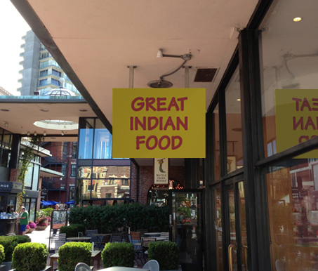
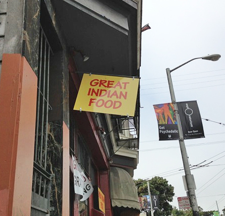
A reader on a west-coast vacation sent us this snapshot with the comment, “Kind of a weird sign in my opinion. Great Indian Food. Hmmmm, really?”
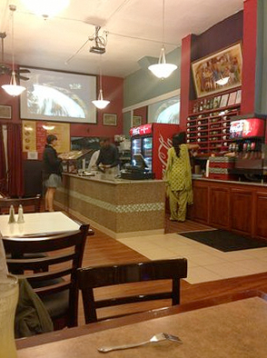
It looks like a Post-it note, but looks, as every designer knows, can be deceiving. Great Indian Food is actually a small, well-reviewed restaurant in the Haight-Ashbury district of San Francisco. What probably threw our vacationer is that the sign reads not like a name but more like a description, along the lines of “Cheap Eats Here!”, especially typeset in clear but curiously non-Indian Tekton and hung carelessly askew, or so it appears at a glance. But venture inside, and you’ll find a crisp, thought-through environment, basically American style with Indian embellishments . . .
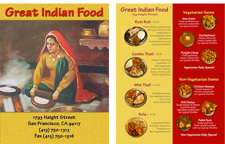
The color-and-type theme continue on the menu . . .
. . . which is similarly flat, plain, and hard-edged. We replied by asking our reader what we’ll ask you, and that is, “What if the sign were in a fresher, more-modern environment? Would you have perceived it differently, and if so, how?”

He replied, “It makes it look a little different, but it doesn’t really make me think differently about it. To me, the sign isn’t believable. ‘Great Indian Food’ sounds like a statement, or like you’re trying to brag. It’s just not a sign I trust.”
He concluded, “Name aside, if it were set in a different font using different colors, then it would probably sway my judgment of it.”
One difference we can see is that in the glassier environment above, you can see in and walk in to check things out (and walk right back out if need be), and you wouldn’t have to rely so heavily on the sign. So context, obviously, matters.
Now that you know what it is, what might be done to improve it (in its original environment) while retaining the color theme? (You might Google India colors and textures before answering.)
—————
For more, check out the Design Talk post, Strolling through the mall one day, and our article, How to design big signs.


I think I can understand the confusion of the person who sent the photo. The sign doesn’t necessarily come across as purposeful, almost as if they restaurant owner emailed the basic information to a Fast Signs shop and received their default setup and “grab their attention!” color scheme (but hey, at least it isn’t Comic Sans, right?)
Because the sign shape and text block are square, the display hanging bar which is askew adds to the perceived laxity of the presentation. Two options which come to mind which may enhance the presentation without overcomplicating are adding an Indian border motif either on both sides or at top and bottom (all four sides wouldn’t help as it would enhance the already present squareness and reduce the available space for the name). This would probably best be done in red on yellow to retain the two color format.
The second option would be to adjust the layout of the wording. Perhaps, setting GREAT slightly arching over the stacked INDIAN FOOD would convey “this layout is purposeful.” If the layout wasn’t so blocky and square, the askew hanging bar would begin to be perceived as a purposeful element of the presentation as well.
Two ideas in the spirit of keeping it simple.
http://www.georgeshearer.com/images/frameshopsign.jpg
LOL! Classic!
. . . and this is on a promenade in a trendy locale in Portland, Oregon.
Hilarious!!!
Sad. India is the place for color, lights, texture, textile, beads, gems . . . ATMOSPHERE! I should, first, go in and scold them a little for not bringing us all at least a tiny, sequin-y bit of glorious Bollywood style and flash. Then I’d set about creating signery and interior décor to match that would be so Diwali-ish and Maharani-ville . . . with typefaces that shriek “Taj Mahal” and “Mumbai” and “Goa” . . . that customers would want to go hang out there just to swoon over and envy the true, gorgeous Indian beauty of it all. The exciting, colorful spice and “flavor” of India should permeate all of the signery and décor and food presentation and staff clothing . . . in order for customers to believe that they will receive “great Indian food” there. And I’d install a big-screen TV for showing the latest Bollywood movies, India pop music videos, India travel documentaries, etc. I LUV! Indian pop and rock music. Maybe Aishwarya Rai would even want to go eat there. Special India events. Well, anyway, there’s a whole lot that needs to be done with this place . . . could be done with the place . . . than just re-make an outdoor sign.
Preach it, sister! Your vision sounds great!
Keeping everything the same on the sign (assuming the customer likes it as it), I think just adding the address below the name makes it seem less like a statement and more like a name.
Maybe a piece of art of India, maybe a landmark from India. Maybe some stroke art of spices / plants
Maybe changing the text to read:
Great Foods of India
Would simply adding “the restaurant” below the existing text (at half the height?) avoid the confusion for the non-cognoscenti while keeping the simplicity of the name concept and the signage? I like the angled hanging, but you could play with at least one line of text at level (angled to the sign) to show the intentionality.
I don’t think the question should be, “Is this sign pretty enough?” or “How can we squeeze this sign into our Indian stereotypes and have it come out the other end all Bollywoodized?”
The questions that should be asked are:
“Why did the owners choose this style?” And, “Is the sign bringing in paying customers?” And, “Do the customers like the sign?”
The sign to me says, “We focus on simply great Indian food – no fuss. And no crazy hit-you-over-the-head Bollywood atmosphere is necessary to compensate for anything less that great food, because our food is just great.”
I also like the “sticky note”-ness of the sign, as though a giant ate there are decided to sticky note it as a reminder to himself to return.
I, also, wanted to point out the difference between design to speak to culture versus designing to stereotype culture—the latter is what the article seemed to suggest ought to be done, and I fully disagree.
The sign is straightforward and no-frills. Sure, it could use a typeface with more gravitas and a less elementary color palette. But slapping additional “India colors and textures” (or whatever Westerners feel signify “India” to them) doesn’t make a strong design.
Great Indian Food is owned and operated by native Indians. I think there is no danger of stereotyping.
I’m totally with you, Kyle.
Plus, if you go all fancy on the signage, it may make the place look more expensive than it is. From the reviews, it looks like it does offer fast service budget food.
Maybe using the same colors as McD’s isn’t such a bad idea.
The brochure inside tells me the sign outside was deliberate and ‘thought out’: In my opinion — badly. Probably the only reason Tekton was used was so the designer avoided using Comic Sans.
If the restaurant is good, then the menu and the sign are a shame. The gulf between the interior colours (apart from the Coke fridge) and the graphic design is glaring.
Also, the sign does a terrible job of presenting in the environment it is in — from the modern glassy mall side, to the traditional rustic side on the other. If I loved this restaurant and knew the owners, I’d do a rebrand for them for a few free meals — and help mankind along the way!
If the restaurant is doing well, who are we to judge their sign? Many restaurants depend on local business, and this one is well reviewed, so it is clear the sign works. People go there for the great Indian food at reasonable prices and most likely admire the charm of that sign. Don’t assume you can improve on it.
Design is about more than whether something “works.” Lots of things “work.” A theater marquee with chipped paint and missing letters “works.” If the local strip mall has what I need, you could say its ugly plastic sign “works.” Each identifies my destination well enough to get there.
What they don’t provide is delight, aspiration. I go there but I don’t love it. There is no joy.
I love beauty and seek it out. I enjoy roaming the Galleria as much for its visual and aural ambience as for the products on sale, and it draws me back. Great design creates atmosphere, mood, desire, experience — it lifts my spirit, stirs my soul, makes the world a more pleasant place to be.
So yeah, we can follow a sign, sit, eat, move along.
Or we can live.
Design can make the difference.
Rough first draft.
Signage and Typography —
I would change to two lines with GREAT above in caps in Geodec Spiral Regular, then Indian Food in Helvetica Neue Condensed.
Keep it dark red on yellow, and maybe add a black elephant silhouette to the right of GREAT with its trunk up — for good luck, of course!
Decor and Dining —
There is a famous Italian restaurant in Sydney, Australia, known only as “No Name Restaurant.” It has survived for over 40 years without a name. Only “those in the know” enter through a seedy back alley, past crates of produce, and upstairs to a basic open dining area packed with chipped tables and an open kitchen. Many years ago, I was queued up chatting on the stairs with the current prime minister and his wife on their way to the opera. Sometimes the food alone and the charm of being only for those in the know proves successful enough.
If the food is great, the sign takes something away. If I were visiting, I would not think the food was good here.
Good design is about communicating an integrated message. It should integrate an experience. The current signage and interior detract rather than complete the experience one ought to have.
Just my two cents.
As with any typical signage in India, the ‘Great Indian Food’ signage seems to have been a child of necessity. The general thought process is ‘People need to know we’re opening a shop here, so just put up a sign board’. There’s not much thought applied to branding, logo design, how this would affect their brand, business and the like. Though this is changing, it’s changing rather slowly.
I think the ‘Great Indian Food’ is one such effort. The board would have been put there as an announcement that there’s a restaurant operational there. And since they probably are drawing regular customers, they don’t really have to rethink their branding strategy. ‘It works for us yaar!’ is probably what they would tell us anyone who wants to redesign their sign.
The same can be said of the menu as well. It has been put together more as a necessity.
I think for this kind of a brand, there would be nothing wrong in stereotyping it. It needs to feel warm, spicy and traditional. It needs to looks totally Indian, while retaining its uniqueness. Add the sequins, bandhini prints, the Indian elephants, anything that marks India’s ethnic character.
So, overall, this sign is stereotypically Indian, to the extent that it has been ‘not designed’, but just produced. Let it become a different kind of stereotype – the ‘lively, colorful and warm’ stereotype that India really is.
Isn’t there something to be said about the fact that we’ve all noticed it and are talking about this restaurant?
It has succeeded in getting attention, maybe getting you into the restaurant — and, if the food is good, then would succeed in making them $. Isn’t that the point?
Personally I’m liking the cheekiness of the low-design style. It says, “we focus on food to the exclusion of all else!” and that in itself is a bold brand statement. To me, this is a statement about modern, high-tech, busy India. “Prove us wrong, I dare ya!” is what it says to me. According to Yelp, they are meeting expectations more often than not.
I’d add a red dot below the name, to suggest a caste mark; and that’s it.
http://mysuma.ru/1.JPG
http://mysuma.ru/2.JPG
To put it bluntly
I like the slogan near the sign. It can be the same for the restaurant.
I wouldn’t change a thing. This is where I find the charm in The Haight. It’s unpolished and unconcerned with the trappings of Union Square. This sign tells me the restaurant is not some corporate chain, and I can feel good that I’m supporting privately owned local enterprise. I once purchased a pashmina from a store in The Haight believing it to be a local shop. I returned it when I discovered it was a chain. That’s important to me. You know what they say . . . the places that look the worst serve the best food! I would expect to be well treated and well fed here.