If you’re a “notebook thinker,” you’ll like Baron Fig, a small line of carefully crafted, take-it-anywhere hardcover and pocket notebooks made of archival quality pages (blank, lined, or dotted) that lie almost perfectly flat. I have a first-run hardcover, and it’s sweet.
Launched in October 2013 as a Kickstarter project, Baron Fig blew past its modest $15,000 funding goal by whopping $153,289! Impressive as that is, what’s really impressive — and why I’m writing — is the fantastic, relentless simplicity of the entire idea.
How do you make such a (seemingly) ordinary product desirable enough to sell at a premium? With design in its purest form, which one trip to their web site will make obvious.

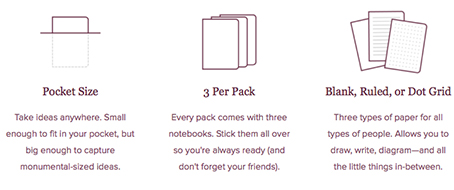
It’s a beautifully simple site with a single focus — to present Baron Fig notebooks in a personal and somewhat precious way, similar to the iPhone. They do it not with hyperbole or lengthy explanation, but briefly, clearly, point by careful point. No distractions, diversions, or sidebars — just a photo, an illustration, a few words, a click or two.

Its design is wide-screen, deep scrolling, mostly white space, with sensitive, quiet typography. You’ll see a half-dozen carefully filmed videos of notebooks in use.
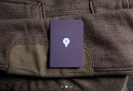
What reminded me of all this is the email I got recently promoting a new Baron Fig model — a “limited edition” pocket notebook with a lightbulb on the cover, handsomely presented against a tweed jacket:

Kinda makes you want one, doesn’t it?
Think about this. It’s a fairly mundane product category. The lightbulb is an image that you or I would easily discard as overly simplistic. And adding it to an otherwise blank cover — how much fanfare does that merit? I would have thought none, but Baron Fig has turned it into an event — low-key for sure, but worth talking about and worth doing well.
I’m smiling. The whole enterprise reinforces for me the efficacy of narrowing an idea to a niche and even a hyper niche and staying with it, carefully refining, proudly presenting, not overlooking the value in even the smallest detail.
Time to rethink a few things.


I don’t know. They look good, but seem like such a blatant rip-off of the Field Guides… I dislike like them because of that.
Isn’t this just a ripoff of the Moleskine notebooks?
Moleskine + apple .com = baron fig.com
Moleskin (poorly made) + apple.com (too high priced) = ?
Field Notes Been using them for years. http://fieldnotesbrand.com They even sell pine boxes (coffins? :-) ) that you can store your notebooks. Amazing designs. Also, UI Stencils has a notebook now with a grey outline of an iPhone where you can sketch your apps. Brilliant! Stencils, carry case, pencil, notebook.. you can design apps anywhere.
What caught my eye was the lightning bolt inside the light bulb – a tiny spark of an idea. I’m not usually a notepad pad person, having been through the whole Franklin Covey time-waste, but these made me think twice…
I love your last paragraph and will write it into my Moleskine little blue, since I don’t have a Baron Fig—yet. Sometimes I think my own niche is too narrow (Final Eyes and the background skill that started it all, typography), then I keep honing it, teaching it, and reveling in anything I can learn about the old-world trades that gave rise to it.
Thank you for this post.
For the small notebooks, I’ve been using Field Notes for years http://fieldnotesbrand.com . For hardcover, I’ve been using Moleskine even longer (like 20 years) and Leuchtturm (for 8+ years). How is Baron Fig better, or even different? How isn’t it a rip-off?
And, while we’re at it — the website looks like thousands of other template-driven sites. It’s a nice site — it just isn’t any more unique than the products.
I believe that their glamour shot of the light bulb notebook on the tweed backdrop is brilliant. Like you, it makes me want to buy one instantly.
Love the picture of the light bulb. Identifies that “eureka thoughts” are contained within and the little filament symbol creates an energy that makes you want to open up the book and jot something down.
Excellent product design and marketing, in my opinion.
Your post is about the design of the marketing plan as well as the booklets, stressing the simplicity and how that works. It may not change the kinds of notebooks anyone buys, but it does make me think about simplicity vs. complex, or cluttered, or just too darn much information to wade through, which generally means I will move on to something else. Thanks.
Wow! After visiting the Baron Fig website, I am even more impressed.
Love the simplicity, the whitespace – that purple color and the green used on the “buy a book, plant a tree” page is PERFECT! Very natural, creative and engaging.
I certainly do NOT agree that this is a cookie-cutter website – a lot of time, design and planning went into this. Simplicity and artful design IS NOT easy and can be time consuming. The site certainly make you want to linger and browse deeper into the content – mission accomplished!
It appears that for some of those who are fans of Field Notes and Moleskine, the idea that anyone else makes a similar product is offensive. I’m not sure why, because neither of those companies actually originated the idea of notebooks.
Some of us are drawn more to the simplicity of design than others, and to the simplicity in presentation. I like the website for Baron Fig. It does make me want to buy the notebooks. I looked at the Field Notes website and, if they were the only notebooks around I guess I’d have to buy some, but I wouldn’t have a visceral enjoyment of owning them. I looked at the Moleskine website (and have owned Moleskine notebooks in the past) and I still think the Baron Fig website makes their products more appealing for all the reasons John stated.
For those who noted the similarity to Apple’s marketing — show a beautifully designed product simply and by noting what people can do with it — that is sort of the point of this whole post, I think. People can detest Apple for whatever reasons they choose, but that approach to marketing is undeniably successful except to those who want to hate them in the first place.
I don’t see anyone acting offended. All I see is folks — of which I am one — pointing out that neither the product nor the website…while very nice…are as wonderfully new and different as John’s write up would lead one to believe. I haven’t actually held one of these in my hand, of course — they may very well BE worthy of breathless prose. But it seems at first blush like just another entrant into a very particular niche.
This article just reminds me why I hate my design job so much.
I think what Baron Fig did was not just create a better note book (I like the fact theirs will lay flat — a simple, but desirable feature most artists and designers desire), but they tell a damn good story. That’s what sells. That and planting trees is pretty cool.
I love well designed Things. A good sketchbook is an intimate item, something with which a creative is very closely tied and upon which great dependence is placed.
If you like to surround yourself with quality (ask Tony Bennett), if you like to look like you have better taste than you do, or — perhaps best of all — if you like to wield pricey items ironically, this notebook’s gotta be had.
When you take a useful tool and add a user experience that involves tactile, olfactory, and visual pleasure, it not only elevates that tool but changes the products crafted with it. Ideas set in such a notebook so designed have the responsibility to become worthy of it. Might not a greater awareness of the act of scribbling creep into one’s musings, scribing on such a scroll?
Moreover, a marketing program that enhances that experience, demonstrating the value of a simple, time-honored tool while honestly claiming the superiority of this particular exemplar (and resulting in a higher price point) deserves our applause. Love the tweed, man!
It is worth every penny they charge for it. Maybe more. Certainly not less.
It’s not a monopoly and there are plenty of less expensive options out there. I would be made sad if cheap, workman-like notebooks got run out of business, but I doubt that will happen. Thank the stars for those ugly little spiral wire-bound lined and margined tablets with nasty kelly green covers. Else, what would the proletariat use to plan their revenge? Where would the Philistine record their mean thoughts with foreheads villainous low?
Just as soon as I get my next paycheck, I’m gettin’ one. Baron Fig, of course. Not the kelly green thing.
Oh, cool article as usual, John! I don’t get a chance to comment as often as I’d like. I always read ’em, and you’re always spot on.
Some of the best ideas were jotted on napkins; a fancy wrap doesn’t make an idea any better (or worse) or creativity any more (or less) forthcoming.
Any piece of paper, with a No. 2 pencil and inspiration, will do the trick!
When I meet with the students from our local tech school graphics department, one of the questions I am asked is “What tools do you use besides the computer?” My answer, without fail, is “A pencil and a piece of paper.” The idea has to start somewhere. I also pull out my array of measuring tools — pica pole; line gauge with points, picas and inches; E scale for type; proportion wheel. Oh, by the way, my pencils have erasers.
My thought of the light bulb on cover was that I didn’t like that it was centered. I would have preferred slightly “up.” I like the idea…. I like the design element, I like the site. But a few pieces of paper stuck together of any type that is within arm’s length of me when I have an idea or something to convey will do. I might well be a Philistine for saying so, but it’s only a means to an end, and a good idea is not made great because it is jotted down in a expensive notepad any more than sitting in a hen-house makes you a chicken.
The definition of “premium notebook” changes when you are fanatical about fountain pens. Rhodia webnotebooks and Qua Vadis Habanas go for considerably more (about $25 for a similar sized book) and Leuchtturm 1917 has them for a similar price and number of pages — but the paper, while smooth, suffers from ghosting and bleeding.
Not sure where Baron Fig vacates in that spectrum :)
Loved the Baron Fig piece, definitely made me want some. “. . .worth doing well” says it all!
Impressive they have managed to summon that kind of investment.
They designed a premium feel product, made a story around it, made it very simple and non complicated so everybody can use it.
And a notebook is something a lot of people use. Clever :)
A notebook can be seductive by design, but ultimately be constraining to creativity.
Another nothing new to market.
There are a lot of notebooks on the market, but most of them have one design fail: The lines or grid are too heavy. Lines and grids should only be faint guides, almost invisible compared to the written notes. Especially when using a grey pencil, the grids are too heavy. A much lighter grid than standard would improve readability. I find it strange that an otherwise competent graphic designer does not think about this aspect. Baron Fig don’t show samples of their lines and grids on the webpage.
I also prefer numbered pages on notebooks over a certain size.