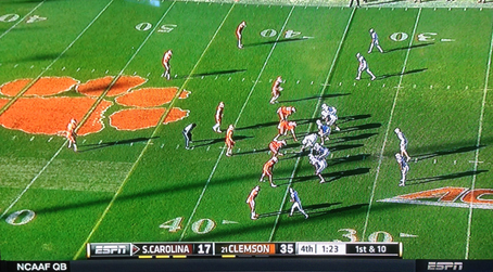
Late in the Clemson-South Carolina football game last Saturday, I became aware of ESPN’s color-keyed scoreboard. I’ve seen it before, as you likely have, too, but this time it stood out, probably because Clemson’s orange is unusually vivid, at least onscreen . . .

. . . which made it unusually easy to connect the name on the board to the team on the field.
This was a design decision. What I like is the visual efficiency of it — a color gradient behind the name is all it takes to let you know which team is which.
![]()
ESPN could have assumed you knew — you are a sports fan, right? — but they didn’t, and their choice makes the viewing experience better.
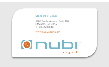
The lesson here is easy: If you want your viewer to connect this to that, give your elements something in common, and color is usually the strongest way to do that. Note below on the Nubi Yogurt card how effortlessly blue connects to blue and orange connects to orange.

—————
Notes:
ESPN’s scoreboard typeface is Klavika Bold, which is also the base typeface for the Facebook logo.
The Nubi Yogurt card and expanded lesson can be found in our Master Collection, articles 0686 (page 2) and 0702.


Huh. I assumed that was understood. As a semi-old guy who has to choose eyewear that either brings the TV across the room into sharp focus or the iPad on the lap for tweeting during games, I mostly opt for the iPad screen clarity. Sure, the HD helps with focus but those color gradients behind the huge font scores are a god-send! Maybe because I needed that visual crutch that I assumed everyone else knew about it too :-)
How would black (team color) on black work?