Last week I came across these panels in the Mott Building lobby of the Kaiser Permanente Medical Offices in Roseville, Calif. I liked the design enough to return twice for another look . . .
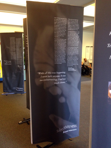
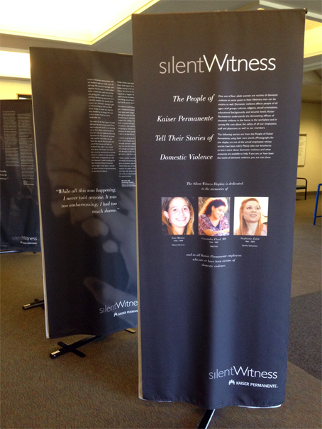
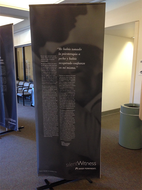
The panels are about 7′ x 3′, sparingly typeset on both sides in white atop very dark, nearly black, photos. The fabric is light and waves faintly when a door opens.
Each panel tells a Kaiser Permanente employee’s firsthand story of domestic violence. Created maybe a decade ago, the presentation is displayed throughout the Kaiser system each October, Domestic Violence Awareness Month.
I love the restraint. It’s a hot-button topic, ripe for sentiment and outrage, but note what’s not here. We see no screaming headlines, no sensational photos (battered faces, for example), or any other attempts to “grab” attention (bright colors, bold graphics, and so on).
Indeed, absent are all of the usual clichés. Instead are stately proportions, low-key typography, understated layout. “It was so serious,” said Kaiser designer Jason Pillon, who directed the work. “We were deeply affected by the candor and courage of those whose stories we were presenting, some of whom are not alive today.
“It was depressing,” he said, “but it couldn’t be bleak. We wanted to convey hope.”
To do this, the designers leaned heavily on memorial-style design, which conveys with heartbreaking dignity the strength that’s born of loss. In style and substance, the panels share elements with the Vietnam Veterans Memorial,
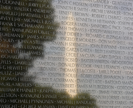
and the National September 11 Memorial,
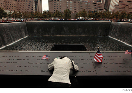
mighty touchstones that bear the weight of a nation’s collective grief.
Below are two of the visual techniques at work:
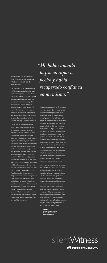
(Above) The design begins with a dark field, which by itself has weight, and most of it is left dark — there is considerably more unprinted than printed area. This “white,” or empty, space allows the eye to settle on the words without pressure or urgency. The result is the sense of certainty and calm — more impressive than shouting or thrashing for attention.
(Below) The panel is divided into three narrow columns. A clear, sans-serif typeface — in this case Gill Sans — is set on wide line spacing (about 175%) and placed into only two columns:
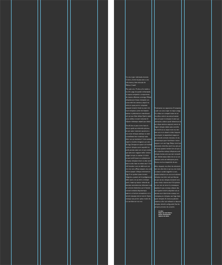
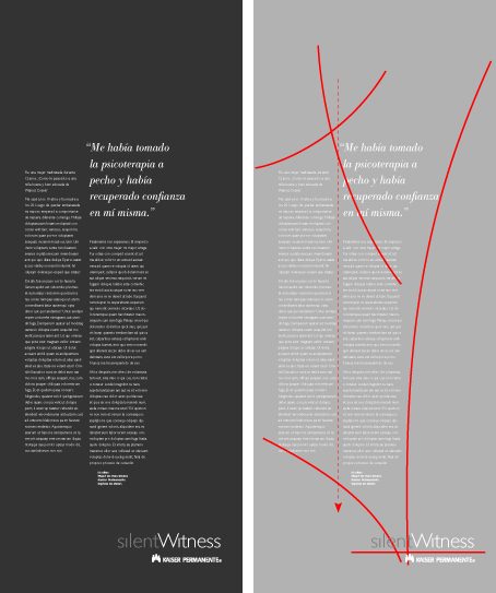
(Above) The thing to note is that the columns are not aligned in a block but staggered irregularly. Why? To create a flow that a block would not. The eye moves with the page, not against; without defined beginning or end, you flow into the story and flow out of it.
(Below) Conversely, a block stops the eye, defines a space:
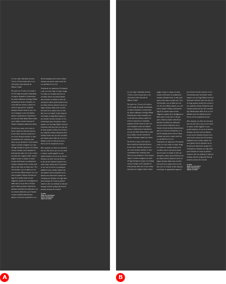 (Above) A block is a visual object. When a block forms in positive space, you get equal and opposite blocks in the negative spaces, which are easy to see above. (A) White text columns blocked to the left yield heavy (black) blocks above and below and leave the right column obviously empty. We call this inactive, or dead, space, visually unproductive. (B) The three-column block divides the page into thirds, which could have significance but is meaningless here.
In another situation these could be turned into successful layouts — a poster grouping different kinds of information, for example — but here they have nothing to do with the story, which we simply want to flow off of the page and into the viewer’s mind.
(Below) The callout — which in this design is the focal point — is set in Bodoni italic, a classic Modern style, line spacing about 140%, and staggered too. Finally, the Silent Witness logo, set in Gill Sans, is added in the lower right against the margin. Both elements bridge the center and right columns, which activates the previously empty column and yields a design that releases its information gracefully (and silently), undisturbed by artificial visual devices:
From the beginning of the project, client, stakeholders, and designers had a bond of trust that yielded a presentation powerful enough to affect viewers years later. Domestic violence, I learned here, is often hidden or denied out of shame, confusion, fear, and can be difficult to discern from the outside. But someone you care about may already be living in silent agony. October is Domestic Violence Awareness Month. I encourage you to learn more by reading the Kaiser Permanente Silent Witness stories here.


The panels LOOK nice, but I would have found it a challenge to read all that reverse text. In recent times I’ve been noticing lots more reverse text used in books and magazines. I’m afraid I find this designer self-indulgence. Reverse text, especially in large quantities, really IS more difficult to read.
I have to agree with Carmel, reverse text, while visually appealing is difficult to read for text of any length. The eye strain makes me give up before the story is finished.
At small page sizes, reverse readability can be a problem. But on these 7′ posters, where the smallest text is 14, 16, even 18 points, readability was not an issue at all.
I used to think this; but, I have been using “Night View” on my phone with eBooks for quite some time and have gotten quite used to it. Still, I suppose if one is not accustomed to it…
John, I have followed you since the first print issue of Before&After. I always enjoy your thoughtful analysis; you help me see things more clearly. And as a survivor of domestic violence, I thank you for using your voice to draw attention to a “silent” issue.
I have also been a follower since issue number one way back when, and your books and PDFs are part of my life. Thank you.
Two questions for you:
(1) I was really interested to see the effect of the staggered columns, but I wasn’t sure I followed your thoughts on why the block text in example A, above was “visually unproductive” — it still looks really good to me — can you clarify further?
On a similar note, (2) I see that the first photo in your piece actually does align the two columns. Do you consider this a less successful banner than the others?
You rock. Thank you for all you do to educate and entertain.
It’s not the text block that’s unproductive but the empty column to the right of it. Any time white (black) space looks obviously empty or blank, you can tell it’s not doing anything. The finished poster with the callout and logo doesn’t feel like that, even though the space is nearly as empty. The design feels complete and correct because the “empty” space has been activated by the callout and logo.
And yes, I think the squared panel with the color photos is less successful than the others.
The fact that these were designed nearly 10 years ago and they still command the same level of interest and dignity says a lot. I am always impressed by what you termed “memorial design” mainly because it DOES have to last so long and keep the sense of honor and dignity. I’m saving these screenshots to show clients how space actually adds weight to a message, and is definitely not “wasted space”. Thanks, John, for another fantastic article!
Excellent commentary and dissection of a design. John, I don’t know how you find the time! But, thank you!
Is is jarring for anyone else that a domestic violence awareness text is set in a typeface designed by Eric Gill? This seems like one of those times when a designer should really, really, really steer clear of him.
Sarah-
Good point.
Wiki quote: “His personal diaries describe his sexual activity in great detail including the claim that he sexually abused his own children, had an incestuous relationship with his sister and performed sexual acts on his dog.”
That was Gill. A disturbed man. His beautiful typeface is ironically chosen for this design project. Even a little research on the type history by the graphic designer probably would have inspired a different choice.
Good call.
Wow Sarah, that is a whole new level of insight. You’d love the movie ‘Rudderless’ — it tells the story with just this theme.
I remember when a certain rock star was accused of child abuse, his famous sports ‘anthem’ was removed from most sporting events overnight; As if the music had been corrupted by the creator himself. Like Eric Gill, the work itself is amazing, it shows beauty, design and craftsmanship, but the designer himself is fallen and broken. My only problem is, if we only use fonts from ‘Good’ people, where do we draw the line?
Is it fitting that a piece of beauty Gill created is now contributing toward healing where he once brought hurt?
Sounds like an interesting movie – I’ll check it out. Thanks!
As far as using Gill Sans goes … if the theme of the panels is, even in part, that abusers are people too, and can make worthwhile contributions to society, then it might be okay to use it.
If the focus is on the people who’ve suffered at the hands of an abuser, then, beautiful or not, I think it’s inappropriate.
Whether Gill should be avoided all together isn’t my point. It’s about context. If a certain rock star’s song is used to support child abuse awareness, would it still be okay to use it for that purpose if they do actually abuse children?
John-
Thanks for your typographic analysis and your love for beautiful design. I visited the silentWitness website and they use the same look there. To achieve this, they used “old” code – meaning HTML tables. In spite of this antiquity, the site is timeless and classic – at least for desktop screen sizes.
If your readers are interested, they should check the site colors used with a web color picker. The black is a very dark gray and the white is a very light gray. This reduces the onscreen contrast which is too harsh with solid black background and white reverse type. This little change makes things more screen readable.
The small touch of “gold navigation links” onscreen shifts the Bauhaus starkness to an elegant color pallete. It always amazes me how little color changes can make such a big difference in aesthetics.
I don’t know about their color usage on the banners but I bet it’s similar.
Thanks for sharing how minimal, asymetrically-balanced design can dignify and show respect for sensitive topics simply by mimicking modern memorials and monuments. Great observations.
One other point I HAVE to make, I’ve found that using ‘white space’ like this in the reverse (black, colour or pale images) stops my clients from wanting to fill it with more text and images!
Thankyou John,
I enjoy your posts and your books. A pleasure to read, and I have learned to much. They help me find the words to explain what is going on in a design – why things work and why they don’t. As someone without formal training this was a weak point for me.
Your reminder about activating dead space was appreciated, and I love “releases the information gracefully”.