Last Saturday before Apple’s rollout of its new iPhones, the photos below were picked up from the popular tech site BGR and publicized by Yahoo!, along with a headline and caption reading, APPLE’S ANNOUNCEMENT RUINED . . .
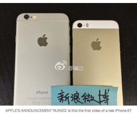
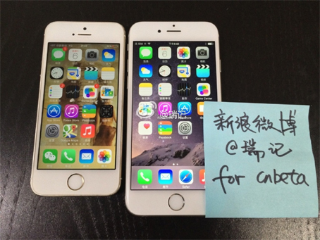
. . . an assertion that’s wrong in so many ways, but for our purposes it’s wrong because of design.
Apple’s Tuesday announcement looked like this . . .
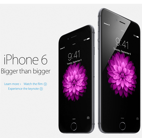
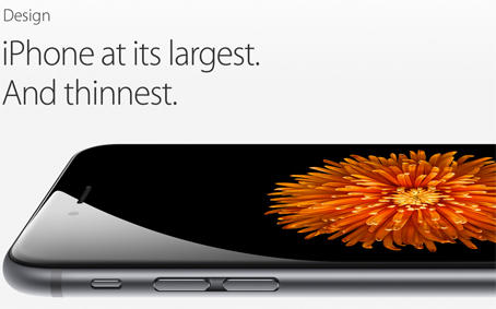
Better than this, actually, because the real thing was bigger. Bright, fresh, crystal-clear, and beautiful, as always. Accompanied as it was by voice, video, and a live audience, Apple’s announcement was a show, bigger than life.
How could anyone equate one with the other? We all know what he meant: I’m showing you their secret phone before they do — snark! Perhaps it was wishful thinking that made the reporter overlook what was in front of his eyes — drab, surreptitious, flash-lit images, blue Post-it note included — and imagine that the public would appreciate his triumph.
This instance is over the top, but it’s a mistake that’s made every day. It’s what yields all those bad PowerPoint demos. Meandering videos. Confusing web sites.
I’d say that all are the natural result of a designer (or someone) short on time or talent; given a choice, people don’t naturally choose the ugly thing. And sometimes that’s the case. But it doesn’t explain the caption. Without it, it would have been a valid spy photo, its faults easily overlooked. But the caption — that this revelation would ruin Apple’s own — was added with eyes wide open.
We see what we want (or at least hope) to see.
I bring this up to say that this mistake is not limited to others. We designers make it all the time. Not this egregiously, but we talk ourselves into something short of the best. The layout that’s pretty much working. The logo that’s kind of right. The concept that’s almost there. Look at them long enough and they start looking right. Or even great.
The solution: Take a break, set it aside, look at it tomorrow. View it in a mirror. Show it to a friend. Listen to the feedback. Stay with it. Whatever it takes. We may be stuck, and we may be out of time, but before we pronounce our design finished, let’s make sure our feet are actually on the ground.
—————
Seems reasonable here to mention Before & After’s The Grid forum, which is filled with bright colleagues who help one another do just that. It’s free and for subscribers only.


Just the pep talk I needed as I struggle with two projects that are both “almost there”. Thanks.
Fabulous post. And so relevant to so many creative endeavors, such as self-publishing.