You know those peel-off size strips on new garments — I love this one from Kohl’s Croft & Barrow brand . . .
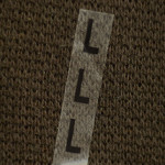
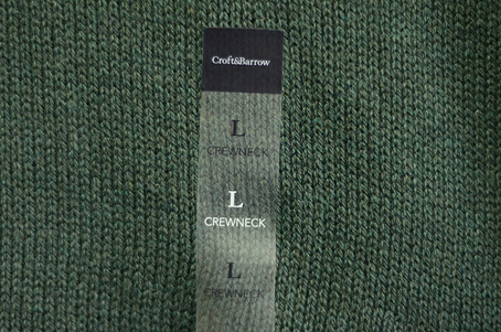
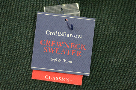
 It’s a disposable adhesive strip, but instead of a cheap-as-possible, utility-grade stick-on (left), they’ve taken the time to design it. Croft & Barrow’s Garamond(ish) logo is printed at the top in white on a black tab, followed by matching, bold Garamond L’s alternating in black and white, each underlined by the garment style spelled out in contrasting, Avenir Book caps, clear as a bell. The strip has typographic continuity with the neck tags (below). Printing in black and white not only adds visual depth, but it allows the type to stand out against every color, so it’s functional both aesthetically and practically (properties that, at their best, always go together).
Besides the look, I like that this detail makes the product warmer, more touchable, more human; it tells me it’s been cared for by real people, hands-on, making art in the midst of their commerce.
Will it make or break the brand? Of course not; it’s too small for that. But it quietly and with modest dignity makes the brand better.
Nice.


Agreed, though I wish I could tap that Croft & Barrow logotype a smidge to the right on the soft & warm crew neck sweater tag.
I would add the ® mark in front of the Croft&Barrow and color it none. It then becomes a place holder, but visually centers the other text.
I’m glad I’m not the only crazy person that takes photos of obscure design things!
I was fortunate to have learned my trade from a master typographer. His words to me were: Our goal in any project is to find the elegance. I have used elegance as my inspiration, be it a 6-line business card or a 36-page booklet. That, coupled with consistency, has served me well over the years. I applaud the words you have used, John: continuity, dignity, functional, aesthetic — all elements that convey professionalism and style.
I’m a Southern Californian and have never heard of Croft & Barrow. Is it a joke on Crate & Barrel, or is Croft older?
I believe that Croft & Barrow is a private label of the Kohl’s department-store chain. I don’t know when it was created. Kohl’s and Crate & Barrel both started in 1962, Kohl’s in the Milwaukee area, and Crate & Barrel in Chicago. And yes, they sound practically identical. One perhaps inspired the other.
Wow, John. I really enjoyed this look at something that often seems insignificant. It’s those tiny details that can differentiate a brand.
It’s one thing to say you care about quality. It’s quite another to demonstrate that in the details. As far as I’m concerned, anything is up for good design, whether a chair or a product label.
The alternating black and white is one of those brilliant design touches that seems obvious once someone does it.
Whilst I agree on the design comments and the sentiment around taking care of the details, you said everything in your first five words: It’s a disposable adhesive strip. It shouldn’t really be there, that design effort could be put to better use in store layout to highlight sizes, there will no doubt be a sewn in size label, and maybe a size indicator on the hanger. Most people will double check before they buy as well. So, what purpose does it serve beyond wasting time and resource for something that will get thrown away instantly? Those little card labels also feel like overkill when you’re in the branded shop buying branded clothing and taking it away in a branded bag. The only function that label serves is to take a little of your time to cut the tag off, and possibly create a ‘pull’ in the fabric if it hasn’t been attached through one of the other labels also sewn into the garment. Even the spare buttons could be sewn on somewhere instead of going into another plastic bag to be removed and forgotten. As designers we should think about all these elements and design responsibly.
Those disposable little strips are actually pretty valuable! Ask any frequent shopper or the sales clerk responsible for keeping the floor neat. When clothes are folded on a table, they serve as indexing strips so a customer doesn’t have to decimate your neatly folded display table to find a Small. It also prevents frustration on the part of the customer having to go on a search through many necklines or waistbands or locating, then flipping around, hang tags to find the size tag. It makes the size search a much more streamlined process for folded items.
The customer shouldn’t have to labor to locate and double-check their size . . . you want them to buy, not hunt down sizes. Also, for a store like Kohl’s, you won’t be carrying the item away in a Croft & Barrow branded bag — it will be in a Kohl’s branded bag. Even for a brand such as Guess? where you will be carrying it in a branded bag, part of the enjoyment of shopping are the little hang tags . . . it also proves that the item is new and unwashed. It also provides a bit of emotional satisfaction to cut a tag off a new item to claim it as yours. And reminding the consumer of the brand they bought an hour ago by having them hold the tag in their hand again is never a bad thing. Those disposable little stickers and hang tags actually do a great deal towards contributing to the shopping and brand experience.