I’m on my way to Chico’s, my wife’s favorite store, to pick up a gift, and along the way I’m noticing signage. Walk with me.
Below is Chico’s. One typeface simply set, the perfect logotype. No graphics, boxes, borders, shadows, glows, swooshes, lines, dots, deeper meanings, or any other complications. The signboard has a frame, and its letters have dimension, which from camera level gives the illusion of an outline, but they’re not part of the logo.
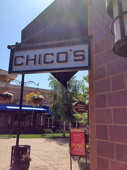
Note the industrial quality of the typeface. Chico’s sells women’s wear, yet its typeface could brand a machine shop, a railroad, a law office, a bank. Aggressively rectangular, single stroke weight, slightly rounded corners, not a feminine characteristic in sight. Similar is the Chanel logo. Is it the typeface you’d choose?
Below is our view down the sidewalk — Soma, Lucy, Coldwater Creek; all, like Chico’s, are simple, short, clear. Soma is signed in overtly sensual Snell Roundhand, an off-the-shelf typeface. Would you dare charge for this? I hope you would, if it perfectly expresses the vibe of the store.
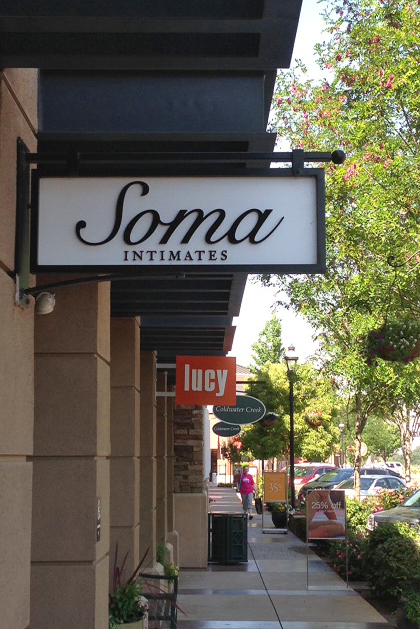
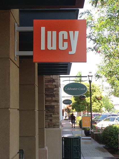
Lucy sells women’s activewear. Its logo is industrial like Chico’s. Heavy, compressed, sans-serif type, white, on an orange rectangle. Feminine? Not by any stereotypical standard. Yet it looks good, it’s easy to identify, and it’s easy to remember. It “brands” well, meaning it’s easily transferred to many formats and venues. It’s a visual oxymoron, and yet it’s working.
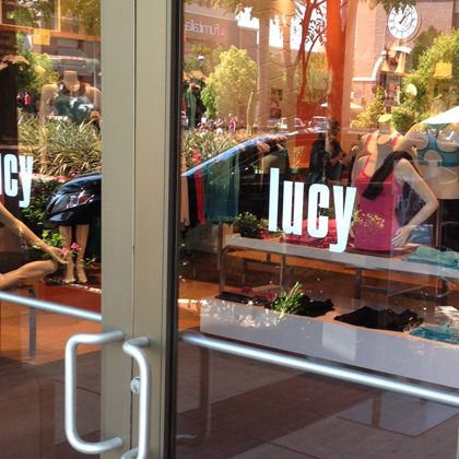
Below, Lucy’s door. So simple. I hope you appreciate how effortless this is. One rectangle (the word) centered on another (the glass). By effortless, I don’t mean it didn’t take time. It took lots of time, mainly trying and discarding more elaborate alternatives.
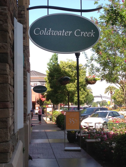
Below, Coldwater Creek, a longer name, is set in Palatino italic, another unmodified, off-the-shelf typeface. You can type it in five seconds (although they should have taken another five to kern the space between words). Could you leave it at this? Or would you feel tempted to do more?
In contrast to the simplicity, around the corner we come upon Sole Desire, whose designer succumbed to temptation. This sign has a funky typeface and a logo, which is comprised of a psychedelic S and a partially obscured D shoehorned into a box. The letters don’t match. The box style is different from the logotype. It doesn’t fit the sign well. It looks like nothing native to earth. It’s hard to decipher.
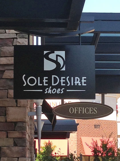
Question is, what were they thinking? Does the SD say something that Sole Desire doesn’t? To find out, let’s take it away, and fix the typeface conflict, too . . .
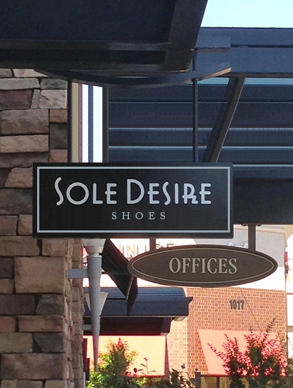
. . . and the result is simpler, more grown-up, more in line with the vibe of the mall. Is it the right look? Hard to know. Sole Desire’s shoes are heavily stylized — party shoes, biker boots, spikes, sequins, things like that. An edgier sign would not be out of line. We can know, however, that their current sign is not the right one. Poor design is never right.
Back to Chico’s and Lucy, the oxymorons, whose typefaces do not expressly reflect their products. Why do they work? They work because they’re neutral without being bland.
 Chico’s, for example, is known for its beautifully complex outfits and elaborate, scene-stealing jewelry (left). What typeface could portray its wide array of styles? A neutral canvas will showcase everything that’s put on it.
Lucy is different. Unlike Soma, whose feminine lines are all boudoir, soft and breathy, Lucy’s activewear is vigorous, outdoorsy, sweaty, drippy — harder. Muscles are being built, which a square logo portrays really well.
The one nod to femininity that the logos share? Both are (usually) set in lowercase. And both can be softened with light colors.
—————
Click here to jump to that Before & After logo article listing a few posts ago.


I think the SD in a box is a shoe — not a shoe I would want to wear, but definitely like some that my shoe-crazy daughter wears. Maybe that’s the point.
Now I see it. Maybe. The heel and sole of a shoe, as viewed from the bottom. Clever idea, but one that requires decent Rorschach skills and that all-critical second cup of coffee. Everybody wishes they could design Gucci’s buckles or FedEx’s arrow.
Thank you! I’ve always wondered why the masculine font of the Chico’s logo works, and figured it was because it’s so ingrained in my visual cortex. But your explanation makes sense.
I like how you asked (regarding Coldwater Creek) “Could you leave it at this? Or would you feel tempted to do more?”
The fact is, I would have a really hard time not doing more because so many clients want to see more, arguing that “all you did was set it the name in a font — I could’ve done that!”
I know, those are the clients we don’t want. But we do have mortgages to pay.
Very valuable, instructional post. Thank you.
Margie
Seems to me that the hanger for the Coldwater Creek sign includes another branding reference. That “swoosh” shape apparently refers to flowing water, albeit outside the context of the logotype and frame. Points off or points made?
Points made.
:-)
The Coldwater Creek hanger swoosh reminds me that they sell jewelry as well as clothes. I thought it came from the liquid silver line that was original and uniquely theirs.
John:
Just in case you do not know about this —
A lot of signage and other things in this little Tennessee town are now being set in Chattanooga’s OWN typeface. http://chatype.com/
Henry Henegar
Incisive comments per usual, John!
ps: the folks at Coldwater Creek have had someone redraw the Palatino italic logo . . . to make it a little less generic? Now it’s a sans . . .
See it at the top of their website: coldwatercreek.com
Wondering if the logo police at Chico’s are aware that the H was capitalized on the sign. Looks like a result of weak local ‘interpretation,’ not a marketing decision.
A quick Google of “Chico’s stores” (click “Images”) will reveal that the two styles are used interchangeably.
I see – looks like their logo has evolved over time and signage hasn’t caught up. Only the logo with the lower case ‘h’ is on their current web site. Been there too many times. The onset of change is usually fast, but execution is inevitably slow.
Regardless of that nit, your point is well made. The unexpected can work, and we need to give it consideration. A different and thought-provoking perspective.
That reply was meant for the article in general. Whoops.
As for Coldwater Creek: not so sure the move to sans didn’t make the problem (logo) worse.
Agreed.
The logo looks colder now (pun intended). Hard lines and sharp corners. I don’t feel “water.” I don’t feel feminine . . . .
At least the previous logo had some swooshy smoothness to it.
Thank you for this insight and clarity of thought (this is one of the reasons you are a design hero). It reminds me of a quote I read recently about Charles and Ray Eames:
“Good designs had what they called ‘way-it-should-be-ness’. . . in other words, if something is really well designed, the idea of it having been designed wouldn’t have come up at all.”
“Back to Chico’s and Lucy, the oxymorons, whose typefaces do not expressly reflect their products. Why do they work?”
Perhaps the design problem was not to reflect their product more so than to maybe differentiate them from other competitors or even break the traditional thinking.
Your thinking that they are oxymorons may be the issue here. Make sense?
On the Soma Intimates, you forget to mention the sub tag, in what looks to be a Garamond. The Snell is offset by the Latin face, and in that relationship we have a context, and each part becomes more effective.
Great post, John.
Simple is best. I agree with everything you’ve said about keeping logotypes minimal. Thanks for the reminders.
I love these articles. They are full of insight and knowledge. I always walk away from them knowing more than before. Thank you for taking the time to put these together.
I’ll second that — I get so much from these articles, thank you!
And I will third that — if that is possible :)
Maybe that is why you are called Before & After. Before, we are ignorant of your amazing ideas and tips and view, and After you share, we are all the more design smart.
Thanks!
This confirms to me the way a designer’s brain works, and it affirms me as having one of those brains. I really appreciate this article and the way you assimilate the questions — I think the inner dialog I have in my head will be much enriched by this article. Thank you and keep us thinking!
Well said!
Excellent article. Designers have to resist adding too much to a logo. On the other hand, it can be hard to sell to the client, but if you stuck to your guns you could convince them that simple is better and will make them more confident and sophisticated in the end.
Good catch, Susan! This article can be a lesson . . . simplicity sells. I agree with you on the Sole Desire Shoes logo. It doesn’t seem to match appropriately with the product, but I did find that they have since changed their logo, and it is evident on their website. It is now more like Chico’s logo.
Thanks, again, for your insight, John. I’ve always loved the Chico’s logo without really thinking about why.
To answer a client who complains that all you did was choose a font, we should remind them that a font is really a collection of carefully designed shapes, just like a logo. We choose a font from hundreds of possibilities because it speaks to us about the brand. You would never use the Coldwater Creek font for Chico’s, nor Impact for Soma. Type “talks” and says all that is needed, very often.
I wish Sole Desire could have done something with that S in the logo because the first thing I thought of was taking a long walk on that S and wearing out my soles.
“. . . D is shoehorned.” boomboom
Curious why they did not use lower case letters for Chicos, as in the bottom page sample and all over their website. I know if I were tasked to create this, it would seem a no brainer. But then, I have been accused of just that! :?)
The two versions are used interchangeably. Uppercase fits bordered signs better.
Agree with you about the SD — and I prefer the revamp design you did — much easier to read.
Chico’s is . . . well just Chico’s — but hey, we all remember it!
Coldwater — not sure on this one — but I’m not sure about the name either! Doesn’t seem to match the product type very well.
But . . . this is just opinion #26!!
Interesting that you chose Chico’s and Soma…. did you know that Soma is owned by Chico’s? I worked for several years at Chico’s and actually, their philosophy is wardrobe based on simplicity….. simple base items which can be dressed up with more “complex” accessories…. One of the reasons why their logo works with their customers. Soma is the “softer, more intimate” side of Chico’s.
It is very interesting, Chico’s and Soma are owned by the same company. They also have White House | Black Market, which is a very interesting logo of simple but well-placed text. Good marketing team.
Spot on. A whole lot of salesmanhship would be required in my world to get the clients to see these arguments; the understated being powerful for logo use. The sheer cleansing power of just gazing on zero clutter, sublime.
Interesting article. Just curious, what part of the country is this outdoor mall?
The mall is Fountains at Roseville (California), just a few miles from our office.
Whenever I see logos like Chico’s, Soma, or Lucy — so clean, simple, and effective — I can’t help but think about the process of convincing the client to accept it. How did the designer persuade the client that this option would deliver? I can see most people who don’t understand branding (well, most everyone) saying, “That’s all? We’re paying you how much for a little type? Shouldn’t there be something in there that conveys clothing, or women . . . or something? A button, a zipper? Couldn’t you put a little more effort into it?”
Excellent points, John. But not sure Chico’s works for me. I’m not as familiar with this brand, and the first thing I thought of was that it was for a restaurant. I think you make some good points, but I think it works in application, rather than on its own.
Yes indeed! Context is everything, as always.
Hi John: I just found your website a month ago through your movie at Lynda.com. And I was so impressed. I found a goldmine of wonderful information to draw from for my websites and other projects. This is just what I’ve been looking for.
All your articles are fun to read. They are each a little piece of the puzzle of good design The above piece on small signs is very informative. How even one word can cajole and encourage us to come in. I realize, once again, how conscious one has to be about the subtleties of color and spacing, and so much more — in order to be a designer. Obviously, you are! Your descriptions give you away. I do not see the way you do. I wish I could.
I have a lot to learn. I’m buying your CD as soon as I can afford it, and in the meantime, reading your articles and just soaking up as much information as I can.
I just wanted you to know that your good skills are much appreciated.
Write more for us. John.
:-) Thank you.
Gloria, don’t miss his videos — great stuff!
But what did you buy for your wife???
I am about to redo the logo for my husband’s sole trader business and will go with just the company name thanks to your instruction.