When designing a logo or other graphic, symbolism is what usually comes to mind. But life is more than symbolism. How about engaging the physical senses? Touch, for example. While it’s not always applicable, a good creative brief should always make you consider it. Ask, “What does this product/service/idea feel like?”
Below are two excellent examples from designer Felix Reichle.
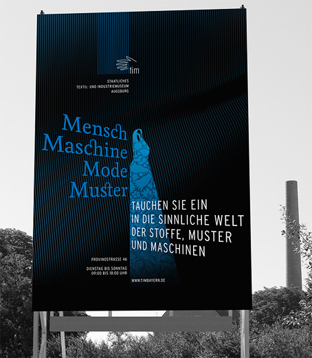
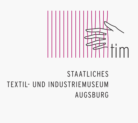
First, a corporate design for the Public Textile and Industry Museum in Augsburg, Germany.
From his summary: My design concept illustrates the aesthetic and sensory experience visitors can get, while it still keeps the industrial and technical context in mind. The museum offers living industrial history to touch. It connects the people with their local textile history and gives a chance to collaborate.
Unexpected and beautifully understated, a light, feminine hand conveys almost magically the sensation of stroking fabric, while the single-line-weight illustration retains the rigor of a good logo. Its construction extends to the type and negative spaces. Brilliant.
The second, more abstract, is a brand design for Hochschulzentrum Vöhlinschloss, an education and conference center run by three Bavarian universities.
From his summary: The arches visualize the central purpose of the establishment, to establish ties. At the same time they represent the three co-operation partners and reflect a prominent architectural part of the building.
Here are beauty, simplicity, and clarity at their finest! Besides the symmetry and symbolism of the logo, note how line weight, color, and translucency convey the sensory effect of the architecture, airy and heavy at the same time.
Remember — touch. Always consider it.
For more on these projects and others by this young designer, check out www.felixreichle.de.
For more on sensory experience in design, check out our article on the Gestalt principle of isomorphism.


Wow, the guy is good. Love everything he has done. Thanks for sending us on this journey.
What beautiful work. Also, incredible portfolio site (does anyone know how it was done? WordPress?).
Yes, very nice work. I looked at the source code and don’t see any mention of a WordPress theme . . . looks like he did it himself or grabbed code from somewhere else.
The code’s the easy part. :-)
Thank you for this.
If I ever wanted to describe to someone what it means to feel a physical engagement with a logo, the hand and the strands of wool in the Textile Museum logo are a perfect example.
Beautiful examples. He is so young but yet produces such fine work. Tnx for sharing!
Pingback: Resources