Our nephew Matt approached me recently to ask if I’d help him design a card and other material for his new diesel-service business, to which I said yes, as long as you’re not in a hurry, although I confess to fastracking it somewhat because, well, you know.
Backstory: Matt is the youngest of my younger brother Pete’s three kids. He grew up learning from his mechanically inclined dad how to tear down and rebuild basically anything. 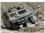 He enlisted in the Army at an early age and was discharged in 2008 after three tours in Iraq and Afghanistan, during which he serviced and maintained heavy vehicles like troop carriers, humvees, and such. He also returned with a fiance on his arm, the one, now his wife, completing her Ph.D in physical chemistry and who, in the Army, outranked him.
Creative brief: Matt’s capitalizing on his Army-honed mechanical skills by starting a business to service vehicles of every kind, primarily big diesels. To circumvent the biggest startup costs, the idea is to build on the concept of onsite service, meaning he comes to you and does the work on your site. Contracting with a city to service, say, its bus fleet, is a goal.
His expectation is to grow, take on employees. For now, it’s “have truck, will travel.” He has a name — McWade’s Onsite Diesel Service — and a stock web site, which we’ll get to next, but first he needs a card. And to get a card, he needs a look.
One guy, a diesel mechanic. A common trade. How to thrive? With excellence, efficiency, integrity, the leadership he showed in the Army, where he ran the shop. What kind of card would such a guy carry? Something low-key. It’s one point of contact, small, light, simple — a card, not a circus.
One night over dinner I show him a Porsche brochure and point out its clean, minimalist design. “Pure, timeless, goes with everything,” I say, to which he replies, “Yeah, I like that.” Hard to tell whether he’s seeing the design or if he’s swayed by the hot cars, so a week later I send him this . . .
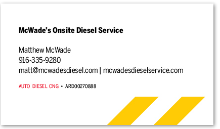
The type is set in Benton Sans Condensed Book and Black, aligned left. The yellow lines suggest the road without being obvious. It’s a low-key look that can go anywhere and be transferred to anything. I like it. It’s simple, it doesn’t look graphic-arty; it respects Matt and his customer by not putting on a show.
Hmmmm, says Matt. “A little lower-key than you were expecting?” I ask. “Yes,” he says, “How about something with diesel stacks?”
Which gives us . . .
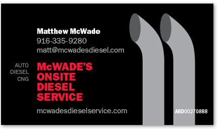
This card takes his idea seriously — two diesel stacks on black, type strongly set, this time in Franklin Gothic. The stacks could perhaps be photos, perhaps more abstractly rendered, or more detailed, but this is enough for the idea. But it’s not right — it’s too diesely, to sooty, too limiting. Where the yellow lines could serve as a logo, tall stacks really cannot, which makes transfer to other media difficult.
It’s too old-school, too; the future is clean. Matt already services CNG, or compressed natural gas, vehicles; his dad drives an electric car. Vehicles, diesels included, are getting green and greener.
But he likes the type, he says. He probably likes that it’s bigger, more complex, more muscular. So let’s try a hybrid . . .
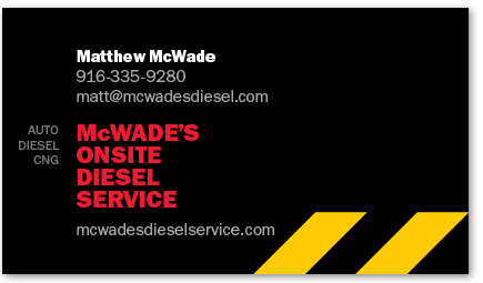
This card retains the type he likes, and the yellow lines are better, more transferable. But I’m not loving the layout — it’s a mashup, too arranged, too designery; it leaves the upper-right side empty and inactive, the opposite of what negative space should be. The black will cause trouble in any case — it has to bleed, it’s expensive to print well, it scuffs easily, even with tough laminate or aqueous coating, and it’s visually aggressive.
So how about a logo? I’m not a fan of logos for a one-man business, if for no other reason than they’re unnecessary. I mean, it’s just Matt and his customer, one on one; a logo would be fluff, an annoying middleman. And I’m stereotyping, but I’d guess the buyer who knows his way around a diesel garage will be unimpressed by frilly artwork.
However. Matt’s vision is down the road; he’s looking years ahead, beginning, as he says, with the end in mind, where a logo may be necessary, so we’ll have a look . . .
Double M continues the on-the-road theme, this time with Matt’s initials. I like this image; it’s compact, symmetrical, transferrable. Returns to low-key Benton Sans type, centered and static (let the road do the moving). What I don’t like is that the extra ingredients convey no better what the double lines say simply and naturally.
Obviously a road, the waves describe a faint M. I like it as a graphic; it shows a feminine side, it’s friendly, more consumer-oriented. For a consumer-based business I would push this happier face. Hard to imagine, though, handing it to a hard-nosed diesel guy. “Awww, how cute!” I hear him saying (or thinking), dismissively. And, like the double M above it, it’s trying too hard.
 Single M with yellow lines could work. Low key, easy to relate to (everyone has initials), and this one feels more natural, less yoohoo! The centered layout is now uninteresting but can be fixed. It’s an image easily transferred to Web, work shirts, all that.
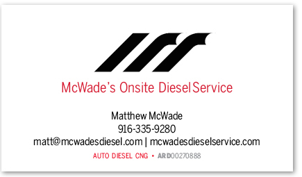
Here is a look only a designer could love — diesel stacks forming an abstract M in a classically black & white mark. Well, okay, a designer who’s been smoking something. Unreadable and unattractive.
Let’s go back. What’s interesting is that we’ve stuck close to the original concept — the yellow lines — rather than provide true variations. There are two reasons for this, the first being our limited time, and the second is that I think it’s the right concept — the lines make a widely recognized image that doesn’t look designed yet represents Matt pretty well and is a strong graphic, easily transferred. And yellow, especially on black, is extremely visible (which is why it’s used for caution and safety signs).
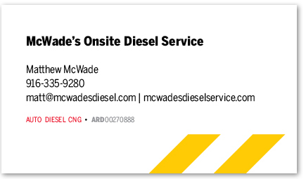
This version is identical to the first card but with a bigger name, and it moves us closer to the stronger type that Matt prefers. But we have one more option.
We’ve seen that the yellow lines are better against black, but how to achieve that without blackening the card or creating a big, visual blot? And how to integrate bigger type and the blockier layout? Let’s change the face from Benton Sans to slab-serif Glypha — forever one of my favorites and the best-fitting typeface I’ve ever worked with — and set it in blocks similar to the diesel-stack card, but lighter, more central, which eliminates the unproductive negative space . . .
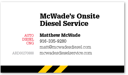
Then anchor the card with a thin strip of black, and place the lines inside. The result is clean, masculine, well balanced, a cut above the ordinary yet without looking designed. Three sizes and three weights of Glypha on rule-of-thirds alignment yields hierarchy, variety and visual interest. Color separates the elements that are different, and it’s used sparingly. This is the finished card.
Before settling, we look at one variation . . .
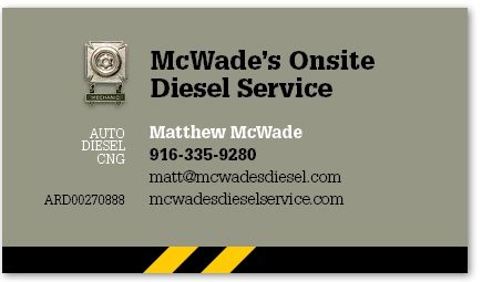
The addition of Army green, plus his mechanic’s badge, ties Matt to his service career and would speak to a fairly large segment of today’s market. But the small type is less readable, and remember begin with the end in mind? This, like the diesel stacks, is too limiting for the future of his business, although it would work as a second card.


Wow! Love the M with the two stripes. That is a striking logo. Masculine, memorable, and road worthy.
Completely agree!
I do like your final white card. It gives the feeling also that it is a reputable business, somebody who can be trusted.
I know that you in the U.S. have spoken on The Grid about QR codes, but I think as this is such a specialised field that Matt is getting into, it would be worth the QR code on the rear of the card to draw the customer to his website for a full rundown on his services.
Rob, I agree about the QR code. They may get a little clichéd soon, but at the moment everyone notices them and tries them out with their iPhones. Great conversation starter. I wouldn’t buy business cards without them at the moment.
Just make sure the QR codes are done right. I can’t count the number of QR codes I’ve scanned on my PHONE only to be dropped on a website that’s in no way designed for the small screen. (Also, QR codes can go to telephone numbers, SMS, contact info, etc.)
If you use a QR code, please make the destination web page mobile friendly!
Ditto Gretchen! I LOVED the M with the 2 stripes and was hoping the final card would incorporate it. That said, I also liked the one you went with. It’s clean and confident. (But I still wish it had the M.)
Sonia, here’s the cool thing — they can both be used! The card as is; the M for the cap and shirt, and so on. The common graphic is the two yellow stripes on black.
Hmm. Come to think of it, I can see how both can be used. Thanks for pointing that out so that I can see that it’s not a question of “either/or” but “also.”
Wow, ten designs. I’m worn out already. Number 9 — the white card with the black strip at the bottom — speaks to me, but I would add the mechanic’s badge to that card in the same place as the number 10 card.
And here we are in the real world with so many options. How many of these designs does any client get to see? I tend to come up with a few designs and then sleep on them so that tomorrow each looks new, as if someone else created them. Then I feel I can be more objective and maybe have the courage to throw some of them away, combine some, or let the client see them all (although I do shy away from showing too much; tends to confuse one).
Thanks for letting us see how your process works. You didn’t mention the nuances of working with a relative. Somehow that makes all the difference in the world.
Mary, we probably had three dozen small variants, all of which were, more or less, the same few designs. Matt saw many but not all. Rarely do I let a client see more than a few, and my preference is to show only one. As for working with Matt, it was easy because communication was so natural. I pitched my recommendations, took his ideas seriously, and he took me seriously.
I love seeing the progression of your thinking. We all do that, but it’s so interesting to see the path that someone else has taken. I like where you ended up.
However, what began as a quick design diversion ended up being a font-buying trip. I’m now the proud owner of Glypha. ;-)
The proposed finished card is OK, but to my eye the “M” with yellow stripes is great — a powerful, memorable image that, as you say, is “easily transferred to Web, work shirts, all that.” It’s a symbol that will work for almost any business that Matt gets into in the future. After all, his request was for something that “looks years ahead.”
If I were designing this, I’d do whatever it took to incorporate that “M” into a final design. Shouldn’t be hard . . . get rid of the centering on that version, and you’re almost there.
Andy, thanks. The primary graphic is the yellow stripes on black, which can be (easily) applied in many ways, one of which is on the M when a logo is needed. It’s easy to envision stripes on an invoice, a site banner, a vehicle door, a shop wall, and so on. An M in all those places would get a little cloying.
Agree! I do like the single M with the yellow lines more than the other. For me it’s the best one, much better than the final one.
Love seeing the process — and really appreciate “hearing” the thinking behind it. Even though I was quite content with the M design, the final version is perfect. Thanks for walking us through the design process. Congrats to having a hero in the family; we appreciate his service and wish him the best of luck in his business.
Like others, I like the final white card and the M logo. My first thought when I saw the yellow stripes was rank in the army.
The mechanic’s badge in the final card feels out of place. What about placing it on the back of the card (maybe a little bigger) along with a QR code? Scanning the QR code can take us to a mobile-friendly page that tells his story — why he’s the diesel mechanic you want to hire. Since the military is a big part of his story and that’s what the mechanic’s badge represents, it’s a good combination on the back of the card. Ideally, a short promo video on the page the QR codes lands on would tie it all up.
Ty, I’m with you. I immediately thought of rank stripes. That’s what being a military brat will do to you!
I noticed the domain name on his email address and website are different. What was the thought behind having two different domain names? Thanks.
I noticed that, too. Not sure why they did it, but two domains can be used for targeting different markets, for tracking offline advertising, for SEO (although that’s questionable). The shorter one seems better for the company’s main website and email address(es).
And pleeese, get his website updated!
LOL! That’s next.
Maybe because of the intro, or maybe because of the Army image, but the two yellow stripes made me think of an Army rank more so than a road. And although that association may not be bad, associating with a specific rank (Corporal, apparently, for a double chevron) is maybe undesirable.
Great card but why not throw him a bone on the URL, or in this case URLs. Try typing in the URL from the card — not simple, very error-prone with this choice of leading and name — http://www.mcwadesdiesel.com.
— First lose the plural; keep it singular. Something about how it sits on the card makes it very hard to type into a browser.
— Add some caps and lose the s, and it seems to give it structure and flow better — http://www.McWadeDiesel.com
Next, don’t use a different URL for your email address than your website address — that’s an easy one!
Love your posts — keep it up. always read, thxDrew
So glad you arrived at a solution that visually expressed his ties to the Army; as a small business, his veteran status could help making those big contracts.
And thank you for showing the many revisions of the design; we were just discussing in our office how a lot of effort can go into properly designing an identity — even for a one-man show.
I also have come to believe that a QR code (see http://goqr.me/ ) is beneficial on a business card. It is a simple way to make the 2×3″ business card a gateway to a video or website without requiring the user to type in a URL. Whatever the URL, shorten it first using Bit.ly or other URL shortener so that the QR code is “blockier” and will reproduce well at smaller sizes (the longer the URL, the more intricate the QR code must be). QR-code-reading apps are free. The one I like on the iPad is Qrafter.
You can use Google Analytics to set up a Custom Campaign and create a special URL (that you then shorten), and this will then allow you to track how many people visit your website (YouTube video, etc.) by following your Business Card QR Code. More: http://support.google.com/analytics/bin/answer.py?hl=en&answer=1033863&topic=1032998&ctx=topic
I’m always reluctant to use URL shorteners on items with a long lifespan, like business cards. If the website ever goes out of business or decides to change their terms of service, you and your customers may have a broken URL (or QR code) printed on the cards. Plus, you’re reinforcing the brand of the URL-shortening service instead of your own company, and some users are reluctant to go to the link if it’s displayed as something different than they expect.
As for the “blockier” QR codes, that’s the result of the level of error correction being used, which is adjustable. Also, using all CAPS will produce a code that’s blockier than if you use lowercase letters.
Use something like http://MCWADESDIESEL.COM/QR and you’ll have a barcode that is similar to anything a URL shortening service will provide. Put the Google Analytics code on that landing page instead of placing it in the URL of the QR code and you’re good to go! You’ll have a long-living URL, Google Analytics tracking and a blockier QR code. :-)
I was taken by how similar the M with the stripes is to the latest logo for my college alma mater: http://webs.morningside.edu/business/
I think I like the final card + the background with the color the best. Very interesting to see the process and steps for arriving at a good solution.
Were I a potential customer, I might be leery of a one-man firm. He could be a true pro or some hack who can’t hold a real job and shouldn’t be trusted around expensive equipment.
I’d go with the Army insignia because it provides a credential, though it is limiting for the future. Better still, if available, a certification line (eg: “ASE Certified Master Diesel Mechanic” or whatever). Is that what the “ARD” thing is?
Your reticence is normal, and one role of a thoughtful, well-presented card is to dispel fears that one has fallen into the hands of a hack. Your ASE suggestion is a good one; and since Matt is indeed ASE certified, we should put that on the card.
Your nephew’s logo is very similar to one I did . . .
http://careycontracting.com
Indeed it is! Nice work — thanks for the heads-up!
Thor! The minute I saw the brief I thought of Thor (and, perhaps, Adventures in Babysitting). Thor, the Hero, the man who bends the machine to his will.
Like several others, I just love the stylized M logo. I don’t think it’s too pretentious for a one-man company, and it could definitely work for the bigger organization he may become someday. In other words, it’s scalable in terms of company size. Looks absolutely great on apparel, too.
I love this! Perfect timing. I am starting a card for my brother-in-law’s appliance installation business (he’s basically a one-guy-with-a-helper operation). He’s had some generic cards before but wants one that’s more designed. I’ve been running this through my head for a couple of days how to make it “tough,” not girly! I’m going to keep this post in mind while I’m designing, and I might just try Glypha!
This was a great write-up. Thanks, John.
Thanks for sharing this with us! As many others do, I like the M very much. The final layout is not balanced enough for me; the “heavy” bottom line is too dominant. Thats why I personally would prefer this version.
My biggest problem with this from the very beginning is the name of the company “McWade’s Onsite Diesel Service.” It says “one man and a toolbox.” This company name isn’t thinking about the future at all. Move the “s” and change the name to “McWade Onsite Diesel Services,” and all of a sudden you have a company, a corporation; and the opportunities then expand to create a more profitable image.
Interesting point of view, thank you. I know this was not considered but now will be.
I like the M with the 2 yellow stripes. It’s great on promotional things like the cap! And I like when the company name is bold on two lines. Seems like those two elements could be incorporated into one card.
I don’t like the mechanic badge, and I think that just the Army green can suggest the Army connection. It would make the card more unique as well, rather than a white background.
Before doing the card, don’t we need to talk about the “brand”?
McWade’s Onsite Diesel Service is a mouthful, too long for a brand, too long to tell a friend about, too long to remember.
A few obvious choices here:
“McWade’s” as the brand,
with “Onsite Diesel Service” as a tag below.
“McWade’s Diesel” as the brand,
with “Onsite Service” as a tag.
“MODS Diesel” as the brand,
with “McWade’s Onsite Diesel Service” as a tag.
Maybe a term like, “We come to you,” or, “Our Expert Diesel Technicians come to you,” or, “Expert Diesel Repair at YOUR location,” needs to be on the card also, since “Onsite” could easily be misunderstood as meaning, “we don’t farm out the work; we do all the repairs at our location.”
So maybe “McWade’s Diesel” or “McWade’s Diesel Service” (MDS?) as the brand, with “Expert Diesel Repair at your location” as the tag.
Just some thoughts . . .
And good thoughts they are, thank you. I know that a few of your options were considered, but I don’t think all. The name will get revisited.
Also, maybe we should take a hint from the windshield repair industry and use “mobile” as the descriptor rather than the potentially confusing “onsite.”
Great article! Love the progression.
One question, Mr. McWade: On the final card, why did you place the yellow stripes in the position that they are in? I keep wanting to move them to the left, so that the black stripe between the two yellow stripes aligns with the gutter between the columns of text (must be that tricky Gestalt kicking in!). Or, I liked their original position to the right. I’d love to hear why the placement was chosen.
Also, I just want to comment on others’ posts: The beauty of such a simple graphic element is that it’s open to all sorts of interpretation. I saw it as road stripes first, but it absolutely could be interpreted as military stripes, too.
Has Matt commented on his interpretation of the stripes, Mr. McWade? (oops, make that 2 questions…)
The double yellow stripe is simple, effective and very flexible. An elegant solution, indeed.
On the rule-of-thirds point, you might try dividing just the white background into thirds, rather than the whole card. The layout feels slightly awkward to me because my eye sees a white rectangle on a black base, not a white-and-black rectangle. To my eye, then, the company name sprawls across the visual third, rather than sitting on it.
Hi John,
I like the final card and all its predecessors. It highlights the amount of time it takes to create strong design. Something folks going into business or even in business do not understand when they want you to do a logo and biz card for $300.
Classy. Minimalist. The company name says what it does. I’m not sure QR codes are necessary. Someone can type in the web site. They feel like more noise. And are unattractive, a visual blight. Once everything gets itty bitty, it’s going to go back larger again. Albums and turntables are making a comeback.
Simon says do this and that and . . . decide for yourself what you want on your card.
Thanks, G.
I agree with Andy Baird. I think the M+stripes is more memorable. I like the final choice but didn’t remember it after reading the rest of the comments, but the M was still in my mind, and isn’t that the point — to remember him?