Generally speaking, a logo, once designed, should be used in a consistent manner and never altered — same typography, same colors, same enclosing space, and so on. We illustrate this in article 0604, which features United Parcel Service’s guidelines for maintaining the integrity of its famous shield . . .
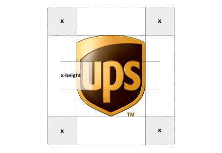
The guidelines include maintaining uniform colors, leaving clear space around the logo equal to the x-height of its letters, and setting a minimum usable size, among others.
Along with the to-dos, there are no-nos, such as,
1) Do not change the logo’s orientation.
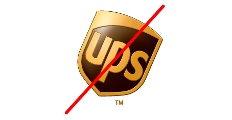
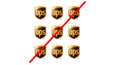
2) Do not use the logo as a motif or a graphic design element.
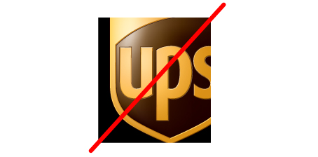
3) Do not crop the logo in any way.
Why so strict? Two reasons. One, because consistency conveys substance and authority, the kind that comes from standing, unchanged, proven by time, immovable, trustworthy, true. Anything that can’t be moved (think the pyramids of Egypt) is substantial and therefore to be reckoned with on its own terms. Two, consistency also gives the viewer a single image to process — you see it and you get it, instantly and without thought. Therefore, it’s memorable.
The strictness, however, does not apply everywhere. Our own logo, for example, is characterized not by its typeface (although it’s changed only twice in 23 years) or its shape, but by its cheery, crayon box of colors. Indeed, one can set Before & After in Comic Sans, and it’s still, unmistakably, Before & After!

Even set in my favorite scribbly typeface, Litterbox, it’s obviously us:

Why is this? Because its colors are its primary (and trademarked) identifying feature. As a result, we are free to modify its other features in many ways, even using our logo as a design element, which UPS cannot do.
Before & After normally appears in one straight line across the magazine cover and on our PDF articles. This is its most-commonly seen setting.
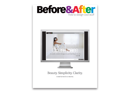
But when we needed a square avatar for Facebook and Twitter, and a miniscule, 16px x 16px favicon, we were able to stack our words and even tilt them without changing their impact at all.
![]()
Similarly, the jewel cases of our upcoming video series will use our logo not only as an identifier but as a design element, in two lines spaced so tightly they overlap, rotated to vertical, and packed, edge to edge, into the space . . .
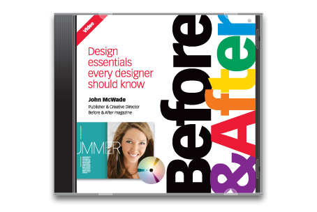
The resulting burst of color and type is vivid, exuberant, visible from a distance while readable up close, and clearly us. It’s not trendy; we’re not following a “style of the day” but, as always, going our own way, which, of course, is obviously authentic.
So in our case, the consistency rule applies to our colors. Same colors, same sequence, same word, every time they’re used. Other elements can change.
Can your logo be used as a design element? Some can. Target, for example. Super simple. It’s a target: bold, red circle, white circle, red dot, Helvetica bold type, all caps, centered.
What’s its primary identifying feature? Its bold, evenly spaced circles, and the red & white colors. You recognize these even when you see only part, and even when they’re reversed to white on red . . .

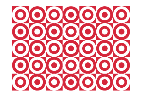
Because of this boldness and identifiability, Target’s logo can be used as a design element, in this case a pattern.
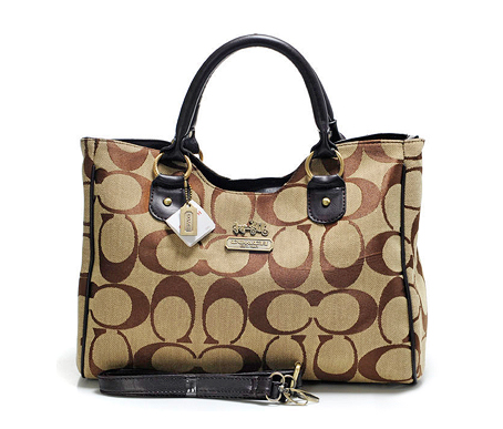
Coach is so successful using its “C” logo as a pattern that the pattern itself has become a look and even a status symbol, widely imitated . . .
Below, General Electric is using a small part of its logo as a design element. This works because the graphic is not serving as the logo itself, unlike Target and Coach.

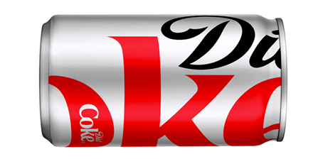
Conversely, Diet Coke’s colors and lines, like Target’s, are strong enough to serve as both logo and design element.
Like many airlines, Delta uses part of its logo, supersized and cropped, to decorate the tails of its aircraft. Bold, simple lines make it possible. Note, though, that Delta’s full name and logo also appear together near the front door. It wouldn’t work without this.


Last, Apple is an interesting case. Its logo is simple, bold, identifiable, and famous — it has all the ingredients, or so it seems, to pull double duty as a logo as well as a design element. But two factors are in play. One, it’s actually rather nondescript — a pudgy silhouette, not quite a circle but not enough different, no interior detail, soft pillowy edges, all low contrasts. Radically cropped like Delta, there’s not much there. Patterned like Target or Coach, it’s oddly frilly. So Apple has less to work with than it may seem.
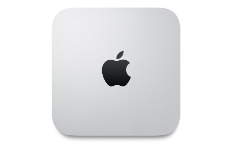
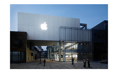
But the second factor is the real one. It’s a design decision. Apple’s vibe is an almost Zen-like minimalism. The empty space around Apple’s logo is the key to its look. For example, you never see this:
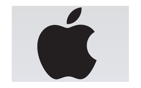
. . . a large apple filling its visual field. Instead, the apple is always small and surrounded by open space, which conveys a powerful sense of calm and self-containment:
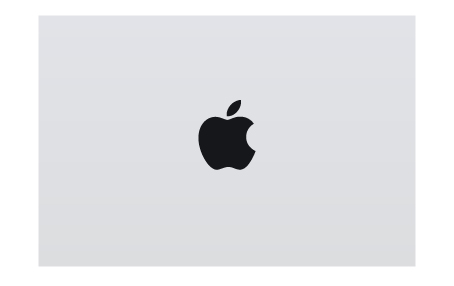
Everywhere you see Apple, you see this space. On its products . . .
. . . on its retail stores . . .
. . . even its T-shirts.

The logo is seen as a whole, alone, in open space. That’s its look and consistency.
How about your logo? The takeaway here is to use strict uniformity like UPS . . . unless . . . your logo has a clear and powerful identifying feature, like our colors or Target’s shape, that you can choose to work into your designs and have fun changing its other elements, assuming, obviously, that it fits your product’s vibe. Consistency, however, remains key.
—————
 The article “Simple, uniform, repetitive,” is available here. Long-time subscribers and those of you with our Master Collection DVD will find it in issue 39.


Can I just say how funny it is that when I opened this article I was on hold with UPS and tracking a package at UPS.com . . . Strange!
Anyway, thanks for the great posts as always.
Pingback: Your logo as a design element | Before & After | Design Talk | Smart Websites and Graphic Design | Scoop.it
I love your articles. You have opened my eyes to many things around me. Keep up the good work!
One of the most difficult things to do is convince small businesses to not mess with the logo. It’s amazing how many don’t consider it a problem.
In a recent redesign of a logo, it was extremely difficult to overcome a long name that couldn’t be broken up and two initials that didn’t work well together graphically. It’s a company that manufactures fence-installation equipment for the chain-link fence industry. The three diamonds of the logo represent the diamonds of a chain-link fence. The orange color was added to pique visual interest. It could be set vertically and horizontally (horizontal version linked below). We did break the rules to fit the square format of the profile space in Facebook and YouTube. The font was the next problem. The problem was making the length of the company name look good. The one chosen seems old fashioned but was believed to fit the company. The three diamonds can be identifiable graphically, such as the website favicon or YouTube channel background. It won’t reach the branding staus of Apple, but it has been on a T-shirt.
http://www.youtube.com/user/LCEnterprisesUSA
http://www.lcenterprises-usa.com/repository/132691286191_logo.png
I knew that my days at a job where numbered when the new CEO decided that he didn’t like our corporate font, and his right-hand woman sent me the company logo, where she had changed the font to his choice using MS Paint.
I know the feeling, Delores. I felt the same way several years ago when I was told by the jewelry importer I worked for to put all the line sheets I’d created and designed in InDesign into MS Pro Publisher so the receptionist could edit them. “Or, better yet, can you recreate them in Word? Everyone in the company has Word!” Sigh. When did graphic designers become undervalued?
OMG.
I feel your pain, Ruth. I’ve had similar requests — very deflating when the client can’t see the difference between a Word document and design.
You’ll get a kick out of this.
Yes, feeling the pain too. Too many people have no idea but think that with some software (Word, PowerPoint, etc.) they can design too. The results hurt my eyes. This forum has been a godsend, as I at least know I’m not the only one stuck in these situations!
Kerry — thank you for that awesome link; it’s made my day!
I have a slightly different take:
The UPS guidelines come from a style guide, probably. That is a guide that tells those who did not design the logo how to use it. Since UPS does not know if the person using the mark has any design sense or not, they prohibit everything that could be done poorly.
I’m trying to say that a good designer can do most anything they want to a logo. A bad one will ruin it.
A very valid point.
My personal logo has a design element that I’ve used in all my branding, such as business card, letterhead, etc.
I’m glad you published this article. =) It gives us designers something to chew on when we’re making logos, almost like a mini-guideline in logo design.
Your examples are great, too. You even included your own logo in the mix. It’s interesting to me how all the seemingly random things about brand identity actually mean something, albeit the meaning is a bit invisible to the naked eye. That bit about Apple at the end of the article makes me see Apple in a new way. Which is why I’m curious if their supposed Facebook page is actually theirs.
It has no attention to design whatsoever, starting with the Profile picture. Bad spacing and use of their shiny logo. Or perhaps they just wanted to have a page so nobody else can use it. Still, it’s a bit odd to see something made by Apple that’s so . . . meh.
Hey Carlos — I was suprised (and intrigued) to see that Apple had abandoned their consistent look on their Facebook page, so I set off to find out what the deal was (usually fake pages don’t have quite that many fans) and came across this article, Is Apple Having a Brand Identity Crisis on Facebook?
Absolutely love the “empty” space surrounding the apple.
“Fill that unused space” must one of the top ten favorite suggestions from pesky clients, along with “Make it bigger, move it higher, and I want it more “designy.”
Yeah, Skip, people just do not respect white space. There is a message in using white space appropriately. I have worked for someone who used way too much text for everything. He liked to ‘give it away.’ I like image to tell the story and less copy/text.
I have been reading the posts/article — I recently purchased a franchise and want to update the logo (33 years old). I don’t want to change the logo itself, just change the font since it is very “busy.” On the building it is hard to read at night until you are right up on it. Am I reading that changing the font isn’t advised? Primary colors are always better? Now I am questioning myself on my decision to change :-D
MJ,
We had our organization’s logo recreated and changed the font. The old font was problematic, as it was a scripty logotype and didn’t represent the organization well. If the logo isn’t good, then it isn’t wrong to change it. But, it needs to be done correctly. First and foremost, it should be done by a professional, in a professional process. I think some of the replies refer to changing logos on a whim by people who aren’t designers, or who aren’t familiar with brand identity.
A change to a logo should be carried out with a carefully thought-out plan. It should not be done on an individual preference without gathering important research. The process may require surveys or group research. A company logo should be treated like a contract. It is a visual representation for the company, and it should have usage rules and parameters to protect it. And it’s important to find some strong visual elements from the old logo to continue in the new one to avoid losing the brand identity, unless that is the intent.
If something as important as a company logo is casually changed by a secretary with non-professional software, then what does that say about the company? It will portray a company that operates with unprofessional or lesser standard practices, and it will portray an unprofessional brand.
What you’re referring to is the idea of re-branding, which is not necessarily a bad thing. It’s very common, especially after change in ownership or a new company direction. In Pepsi’s case, re-branding has almost become a part of the brand. It helps them to create a fresh, cutting-edge feel to contrast Coke’s never-changing classic position.
But as Cat mentioned, you’ll want to make sure you do it professionally and consider what each change is saying about the company. Make sure you research what the current brand is saying about your company and make purposeful decisions on what you want to change and why.
The key, however, is consistency. Re-brand works if everything changes to the new look and is consistent going forward. I think what other commenters are referring to is that you should not change your logo font on a whim because you’re in a different mood one day, or let each employee choose their favorite color for the logo that they use on their business card (unless that’s part of your brand).
So don’t forget the main point of the article. Consistency is key. If you change the font, it should be change that happens everywhere, which is why it should not be taken lightly.
Hi!
I bought your DVD packed with “amazingness”!
I love the way you write — it is so clear and concise and simple.
Keep it up!
I especially love logo-related articles. Logo creations are my favorite!
Thank you!
John, for me the key info from your article is this:
We cannot generalize! There are logos, and there are logos. Some can be used in a flexible way, others cannot. It has to be analyzed carefully.
This work should be done by a professional! Like us! ;-)
Our corporate logo was updated around the millennium. The colour combination was retained, but the font was updated and a new figuremark added. It was a good change, because the old one was something like Rockwell or Playbill — it screamed 1970’s cowboy movie. The new one is based on a modified Rotis Sans and is much cleaner and a better fit to our core business (scientific equipment). I don’t know the designer of our new logo, but they got it right.
Thank you for helping me to to see/think wordmarks/logos through as lines and shape, plus colors. I often need to be able to keep brand recognition but with some visual variation for different items.
Very nice and informative article. As I see it, the simpler the logo, the longer it lasts and more design freedom it offers ;-)
Once your mind and eyes are open to the possibilities you’ll see more and more examples of better practices wherever you look.
Since 1993 Air Canada has chosen to represent their maple leaf symbol as faux-foilage super graphic on the tail of their planes, while maintaining the maple leaf symbol within or without the corporate signature in other applications. This work was done by Diefenbach Elkins.
Since 1997 IBM has been able to letterbox their TV advertisements between blue bars, and achieve instant brand recognition with just this subtle reference to the blue bars of their monogram. This was Ogilvy.
Courtney Reeser, who was one of my many mentors in a tremendously rewarding life in design was fond of correctly quoting Ralph Waldo Emerson from the essay Self-Reliance, “A foolish consistency is the hobgoblin of little minds…”
Rubber stamping, or the act of applying a ‘logo’ in a rote fashion to all customer touch points, is NOT an identity that communicates anything positive, but it does communicate in the sense that Erik Speikermann intends when employing the Paul Watzlawick quote, “One Cannot Not Communicate”. Every behavior is a kind of communication.
Using your visual assets creatively, efficiently and with versatility to consistently support your brand premise communicates that you may be able to do so with all of your resources: human, financial, material; what client doesn’t respond to that message?
Hi John,
It is amazing how the name of a fruit came to be the most renowned name. To me, it’s always the service and contribution that the service or item give the society. That is what, at the end, will make the name succeed. Of course, the logo will be recognized anywhere. For me, service is the keynote to get a brand and a logo to a higher position.
Hi John,
I’ve been reading your articles for a while, and they are real help in simplifying the concepts. Thank you for that. One thing, however, bothers me, and it’s about the Before & After logo. I understand the stages “Before” and “After” are supposed to reflect opposites, i.e., “Worse and Better,” “Chaos and Order,” “Bad project and Good project” follows from that why “Black” is “Bad” and “Colored” is “Good.” I understand that the client may think in the way your logo works, but are you honest to yourself? I bet you feel bad watching your logo and would feel better inverting the colors.
All the best :-)
Thanks, Wiktor. Actually, we like our logo as it is. We designed it in 1989 when desktop publishing was new and everything was still in black & white on plain paper. We wanted color and vibrance without being unrealistically glossy, and we also wanted to be light, cheery, approachable, unlike the condescending, design-magazine air of the day. To do this, we applied the “box of crayons” light spectrum to the word “After” to connote that a flat, black & white “before” could be transformed into a vivid, multidimensional “after.”
That 1989 version also used two typefaces — ITC Machine and Century Old Style, both popular at the time — to convey a similar leap from a blocky, unsophisticated “before” (common in the early days of desktop publishing) to a refined, erudite “after.” Our 2002 redesign simplified the logo into a single typeface, Vectora Black, which we use to this day.
Our original, 1989 logo . . .
The illustration I got here is really one of the best ones I’ve read so far. The different elements of logo design you explained here are completely agreeable. Here is one more resource on logo design essentials that i found remarkable just like this one.
Pingback: It’s worth protecting! Have you? | Graphically Speaking
Regarding airline logos (and aircraft tails) American Airlines must have been listening when you were speaking of BA and Delta.
Our company delivers healthcare in the home, and our logo includes a simplified house graphic (frame, roof, and door). My manager says we cannot use a house graphic (even modified so it doesn’t look exactly like our logo) in any of our visual communications because it is part of our logo. I see her point and was trained to believe this, too, but I say that we can use a house because it is a generic concept and is sometimes essential to convey the service we deliver. Who is right?