Once upon a time, I knew everything there was to know about Page- Maker, at least from a user’s point of view, and in the infancy of desktop publishing that made me something of a guru, the guy atop the mountain up which you’d trek to get answers. Even Apple would phone.
But that was then. Life got busy (thank you, Before & After) and took me in other directions. Today, software-wise, I’m in with the crowd. InDesign, for example, can do so much that I don’t even know half of its features, much less use them. I just figure I’ll learn as the need arises, and, yeah, I’d be more efficient at this or that small task if I knew the shortcut, but hey, it’s small, and I don’t have the time.
 So last Monday I get a note from type designer
Ulrike Wilhelm (left), along with her latest typeface, which she’s calling LiebeDoni — Liebe meaning love in German, and Doni being short for Bodoni. Like her others, it’s hand-drawn, only this one comes with more than 600(!) glyphs, which are alternate characters and swashes and ligatures and all the rest.
I install her font and start typing. But when I try using the standard Option and Option-Shift keys (Mac) to access its special characters, all I get are the normal diacritical marks, not the fun stuff.
Hmmmm. With more-ordinary typefaces, one gets to special characters — small caps, for example — by selecting a different typeface. There’s Adobe Garamond and Adobe Garamond Expert, and the special characters are in the Expert set. But LiebeDoni is a standalone font.
“Ulrike,” I write back, “what’s the secret for accessing your glyphs?”
Next morning she sends me a (simple) lesson in InDesign glyph-finding. This makes me only slightly embarrassed until I begin asking around the office, and no one else here knows this, either. So I figure that if it’s new to us, it may be new to you, too. So here’s a look at Ulrike’s new LiebeDoni, plus how to make magic with big character sets.
By the way, she says that if you like the font, it’s 30% off for Before & After readers through September. Enter bamagazine_30% in the gift code field.
A (small) taste of Italy
LiebeDoni (below) is a fairly straightforward hand-rendering of Bodoni Black . . .

. . . but without Bodoni’s filets, which are the filled curves that join stem to serif and would look like this . . .
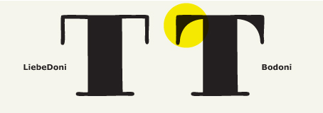
It comes in a solid version (above, left) and an outlined version (below), which I find more entertaining . . .

It also comes with more than 600 glyphs, which are alternate characters, swashes and ligatures. Below, for example, are some of its curlicues and five different ampersands . . .

The fun began once I got to the curlicues via the Glyphs palette . . .

. . . then converted the type to outlines and began coloring:

Although Ulrike bills LiebeDoni as an Italian typeface, I enjoyed it more in this festive dress that resembles stained glass:

Anyway, there are two ways to access InDesign’s glyph sets. One is to call the Glyphs palette . . .
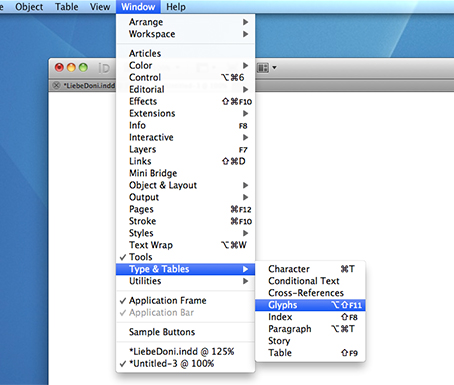
. . . which looks like this:
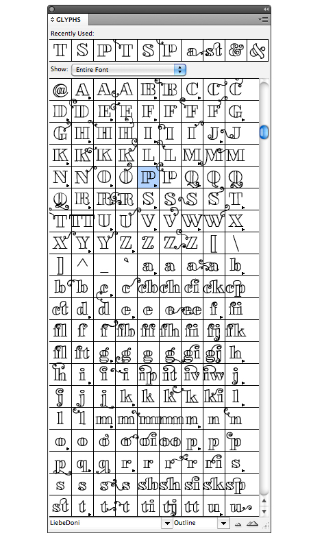
What I like is that the Glyphs palette displays every character in the set (note in this case that it scrolls a long way), which makes shopping a breeze. Select the character you want to change . . .

. . . then in the Glyphs palette, double-click an alternate setting. It’s sweet.

Glyphs can also be accessed via the Character palette. This limits you to one alternate, which for most fonts is all there is. LiebeDoni has more than that.
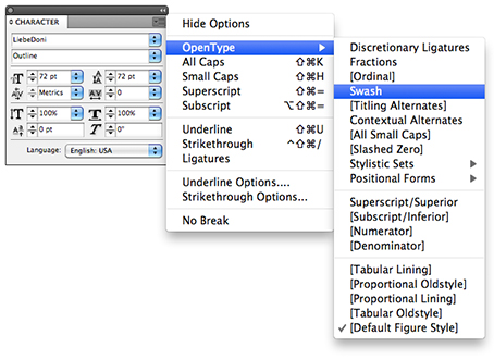 Unlike the Glyphs palette, the Character palette allows you to set an attribute in advance, so InDesign will replace every instance as you type. This is ideal for fractions, small caps, old-style numerals and such, which you want in every case, and sometimes for discretionary ligatures like the ki, below, which you typically want in some instances but not all. . .

For Swash, it’s not so good . . .

So there you go — our discoveries for the week. A new typeface, plus InDesign’s glyphs. LiebeDoni is extensive enough that I lost a couple of hours exploring its nearly endless iterations. It’s pretty fun. If you like it, remember that it’s discounted through September.


John,
OK, again I am amazed. That my guru just learned something I knew ages ago and was humble enough to pass it on with that admission. You rock, as always. Great article. Cool font.
Jim
I discovered the Glyphs palette either by exploring the various menus or possibly from the Adobe “Classroom in a Book” series — and it’s been indispensable for creating invitations using Bickham Script (I think that typeface has the most alternate glyphs and ligatures of any in my collection).
Thank you for letting us know about LiebeDoni — it’s quite lovely!
The Glyphs I first became aware of in Illustrator, and later in InDesign. It’s a marvelous feature, and has been around for a few years.
Cute font, btw.
Regards,
“The Chef”
Thanks, John.
Re: “scrolling a long way” to find alternate glyphs: If you click on the teeny-tiny black triangle at the bottom right of each character cell along the top rows, you will see more cells with all the alternate glyphs for that character. Those aren’t extras; they’re the glyphs that occur farther down the palette. It’s just a convenience.
But you already knew that . . .
While there is lots I don’t know about InDesign, I’ve use the Glyphs palette often for accessing special math and Greek characters. But some fonts have so many characters that it was like a treasure hunt scrolling through looking for what I wanted. It took me awhile to discover that I could find them easier on the Glyph palette if I restricted what I was looking for from the little pull-down menu near the top, which by default shows the entire font. By choosing “Greek” for example, I end up with just the Greek symbols to wade through. Huge time-saver!
I’m a big Before & After fan. I consider myself an amateur designer, but you help make my work look a little more professional. Thank you.
Love the LiebeDoni font . . . I’m a sucker for the swashes and alternates; looks like I’ll be taking advantage of the discount (thanks, Ulrike).
I wanted to point out another handy feature in InDesign’s Glyphs palette, for those who aren’t accustomed to using it. In the “Show” drop-down menu within the palette, there are many options to help you narrow down the number of glyphs displayed (which can be really helpful with a font such as LiebeDoni, with so many glyphs to sort through). I often utilize the “Alternates for Selection” option: Using “Pasta” as an example, if you highlight the “P” with “Alternates for Selection” active, the glyphs palette will show only the options for the letter P, so you don’t have to scroll and scan through all 600 characters.
That is very sweet! Ok, now, how does one access the Glyphs palette in Photoshop?
Thanks!
My professor in college made us learn graphic design with no computer for the first semester. Her goal was to teach us to think like designers before we touched a computer, let alone a design program. Now I don’t feel so bad about not knowing every single nuance of Illustrator or InDesign, because knowing the programs certainly doesn’t make you communicate well as a designer.
But I did happen to know about this feature of ID (patting myself on the back). Thanks for another great post and for inspiring me yet again. Really nice font. It’s even offered as a webfont. I’ll definitely be picking this one up.
Brilliant and thank you. You have just opened up a whole world of stuff that was just hiding under the surface. You are so wonderful at inspiring and informing. Cheers, sarah
The “Glyphs” palette is also located in a more easily accessible place than under the “Window” menu. It’s in the “Type” pull-down menu at the top of every InDesign document window too, or can be accessed by holding down the option and shift keys, and pressing the F11 key.
I loved your “stained glass” example so much that I purchased LiebeDoni. Hopefully I’ll come across a project soon where I can use this effect!
In case anyone else is curious, in Photoshop, the glyphs can be accessed using the Character Palette flyout menu’s Open Type sub-menu.
This article is quite funny and yummy to me. That’s because I thought that accessing glyphs in InDesign is common knowledge, so seeing John McWade learning new things as he goes is like fresh air. Well, this is technology that needs to be mastered. And design is not technology. I have a few friends in Belgium and also here in Romania who started as designers before the computer would help and make everything easier, who could explain rules and how to break them. But now with all the software, it’s a race to have.
As for the type, it’s very nice, like a flower that you always discover in a new way. Way to go Ulrike!
Great article — it shows the use of glyphs and swashes and young people still interested in letter design. I’m definitely going to use your article as a statement in my lesson micro-typography.
Here’s a question for you guys: Can a font like this one be used in a logo? I read through the licensing info for LiebeDoni and, to me, it wasn’t super clear whether or not logo usage would be okay. I’m thinking not, but could someone clarify this for me?
Thanks for bringing this wonderful font to our attention, John!
@Whitney: Thanks for asking! Yes, using LiebeDoni to create a logo is perfectly fine as long as the font file itself is not redistributed (= passed on to someone else).
So when passing on the logo digitally, make sure it is either rasterized (as in a .png or .jpg pixel file), or that the logo type is converted to outlines.
Thanks to everyone for the kind feedback! I am so glad that so many of you appreciate my work. And thanks to John for the wonderful article!
@Ulrike: I greatly appreciate your reply. Thank you for creating such a wonderful font. Designers like myself are so fortunate to have people like you working diligently to create unique, beautiful typefaces. I can’t wait to purchase and use LiebeDoni!
@Jan Middendorp: Thanks so much for your reply, too!
I love it when I find a font with all the extras in the glyph table. Check out anything by Laura Worthington, too — I use Yana and Origins a lot, and the array of extra letter options is mind-boggling.
The Glyph palette is a truly awesome tool. In some fonts you can find alternate drawing of characters with different ligatures and so on. What I can’t understand is that it exists in Illustrator but not in Photoshop . . . but I’m not alone: http://typophile.com/node/16123 and http://typophile.com/node/32683.
So John, if you have any traction with the Adobe guys, this would be a worthwhile endeavor!
Nice article. Adorable font, I am afraid I will have a shopping spree at MyFonts. Thanks you for the tips. I knew how to access glyphs in ID, but I join Jim Bellomo (very first comment): generous and humble of you, John. Then I though about this phenomenon that you guys in the office did not know about this. Maybe it has something to do with the language. I am Hungarian, live in Germany, and our company has clients from all over Europe. I, and, I guess, other designers around here, are used to different languages with many different characters. If I write a French text or my native Hungarian, or do something for a company that has subsidiaries in Poland and the Czech Republic, I need glyphs pretty badly. Not just the 26-character English alphabet. Probably this is why. But then again, it is just a guess.
@ Whitney:
A quick answer from Jan at MyFonts:
Yes, designers may use a font they bought to make a logo, unless the licensing info explicitly states otherwise. Usually it’s OK — but graphic designers are never allowed to pass on the font itself to their customers, be it in the original version or a modified version. The best way to deliver a logo is as a vector eps file (with text converted to outlines).
(Ulrike just tells me her own reply is awaiting moderation, but I’m posting mine anyway ;-)
This was all new to me. Thank you! I taught myself how to use InDesign using Deke McClelland’s One-on-One workbook, and I’m learning about design from Before & After.
What tool or feature do you use to color in the fonts to create the stained glass look? I love it! . . . bought the font and want to try it.
In InDesign . . .
1) Set your word in LiebeDoni Outline
2) Select the text frame, and go to Type > Create Outlines
3) Go to Object > Paths > Release Compound
4) Click on a filled shape, and then color.
Thank you!